The museum gift shop
The library, the toolbox, and a thank-you.
Everything at The Dictionary of Color Combinations is free to browse and copy — that will never change. This page is what to reach for next. The books that taught us the material — both volumes of Wada, the Albers classic, and shelf-defining histories of color. A short list of tools that pair with the archive. And a tip jar with the full bundle attached as a thank-you.
Or, if it suits you better:
- Kuretake Gansai Tambi 48 on Amazon Twice the pans, so you can mix toward a specific plate instead of approximating it.
- A Dictionary of Color Combinations on Amazon Wada's plates in print, if you would rather look before you paint.
Buying it as a gift?
- For someone who loves colour: the two Wada volumes as a set on Amazon Two small books of colour plates, with nothing to set up.
- For a painter: a Strathmore 140 lb watercolour pad on Amazon Painters get through paper, and this weight takes a wet wash without buckling.
Affiliate links. As an Amazon Associate we earn from qualifying purchases.
Library
The library behind the archive
Every palette in this archive stands on the shoulders of these books. Real criticism, real history, real judgment. If you want to go deeper than hex values, start here.
Book links are Amazon Associates affiliate links. Your price is unchanged; a small commission supports the archive. As an Amazon Associate we earn from qualifying purchases.
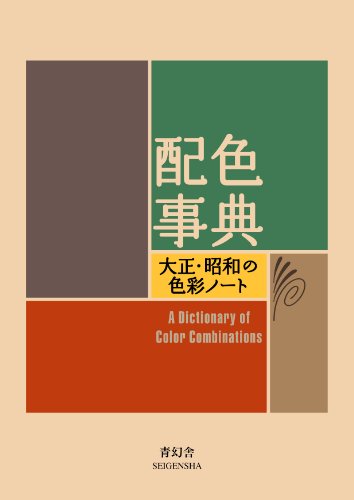
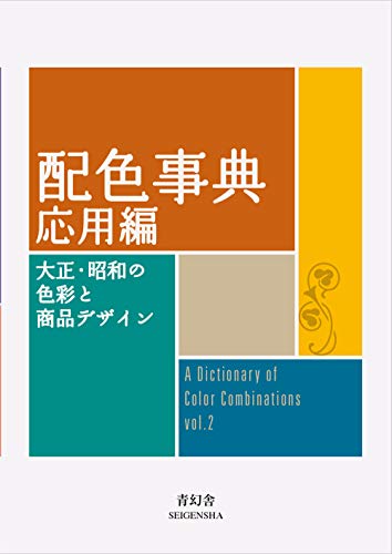


Torn between the two Wada dictionaries? Vol 1 vs Vol 2, compared plate by plate →
Book links are Amazon Associates affiliate links. Your price is unchanged; a small commission supports the archive. As an Amazon Associate we earn from qualifying purchases.
Studio
Off the screen
A palette is a set of decisions until someone mixes it. These are the materials — Japanese watercolour pans, paper that takes a wash, and the one reference that survives the trip to a printing press.
Affiliate links — as an Amazon Associate we earn from qualifying purchases.
-
Pantone
Color Bridge Guide Set — coated & uncoated
This site hands you hex codes. Color Bridge is the deck that shows what an RGB or HTML value becomes as CMYK ink, and which Pantone spot sits nearest it — the translation step between a screen palette and a printed one. Coated and uncoated because the same ink is not the same colour on both stocks.
Listed on Amazon as Pantone GP6102B Color Bridge Guide Set Coated & Uncoated, Multi-Colour
-
Pantone
Color Bridge Guide — coated
The coated half on its own — Pantone to CMYK, RGB and HTML in a single fan. The smaller entry point if your work only ever goes onto coated stock.
Listed on Amazon as Pantone Color Bridge Guide Coated | Pantone to CMYK, RGB & HTML Color Matching Fan Deck for Graphic Design, Branding & Print | GG6103B
-
Calibrite
ColorChecker Studio spectrophotometer
A spectrophotometer profiles the whole chain — display, printer, projector, scanner — so the colour you picked is the colour that comes out the other end. The full-fidelity option for work that ends up printed.
Listed on Amazon as Calibrite ColorChecker Studio Spectrophotometer for Complete Color Management for Display, Projector, Printer and Scanner Profiling
-
Calibrite
Display Plus HL colorimeter kit
A colorimeter calibrates the monitor itself. Worth saying plainly: an uncalibrated screen is the most common reason a palette that looked right on your desk looks wrong everywhere else.
Listed on Amazon as Calibrite Video Photo Kit with Display Plus HL Colorimeter and ColorChecker Passport Video 2, 10,000 Nit Monitor Calibration, Camera Color Matching
-
Calibrite
ColorChecker Passport Photo 2
A pocket target for fixing white balance and exposure at the moment of capture — the step before any colour correction, if your palette starts from a photograph rather than a screen.
Listed on Amazon as Calibrite ColorChecker Passport Photo 2 Portable Color Calibration Kit for Photo and Video, 4 Target Set for White Balance, Exposure and Creative Look
-
Kuretake
Gansai Tambi 24 — Art Nouveau
Gansai are traditional Japanese watercolour pans — dense, matte and easy to mix, the closest everyday medium to the flat printed colour Wada's plates were made in. This is the Art Nouveau-themed 'II' edition, a different 24 to the standard set.
Listed on Amazon as Kuretake GANSAI TAMBI Watercolor Paint Set 24 Colors II - Art Nouveau
-
Kuretake
Gansai Tambi 48
The larger pan set. More range means mixing toward a specific plate rather than approximating it from a handful of colours.
Listed on Amazon as Kuretake Gansai Tambi Watercolor Paint Set, 48 Colors, Made in Japan | 48 vivid opaque colors, non-granulating pigment, large pans, palette & color chart, Professional Use, Artist Grade
-
Strathmore
300 Series watercolour pad, 140 lb cold press
140 lb cold press is the weight that takes a wet wash without buckling — the paper most colour studies end up on.
Listed on Amazon as Strathmore 300 Series Tape Bound Watercolor Pad, 140 lb. Cold Press, 11 X 15 inches, White, 12 Sheets (360-111)
-
Pentel
Fude Touch brush sign pen
A felt brush tip for the labelling and linework around a swatch study — the annotation half of a colour notebook.
Listed on Amazon as Pentel Fude Touch Sign Pen, Black, Felt Pen Like Brush Stroke (SES15C-A) 3 Pieces
-
Pantone
Formula Guide — coated & uncoated
When a palette leaves the screen, this is the shared vocabulary between you and the press. Coated and uncoated because the same ink is not the same colour on both.
Listed on Amazon as Pantone Formula Guide – Coated & Uncoated New Version | Professional PMS Color Matching System
Amazon Associates affiliate links — your price is unchanged and a small commission keeps the archive free. As an Amazon Associate we earn from qualifying purchases.
Prints & posters
Museum-grade poster sets.
Each palette, printed as a single plate — generous margins, archival matte paper, designed to sit on a studio wall the way Wada's book sat on a studio shelf. Printed on demand, shipped worldwide.
Prints launch after the first batch of early supporters — subscribers hear first.
From the archive
Support the archive The full catalog, on your disk, as a thank-you.
- All 378 palettes (348 Wada + 30 editorial) in five formats
- Figma design tokens (W3C-spec JSON, drag into any file)
- Tailwind v4 + v3 configs — drop into any project
- CSS custom properties — every plate, one stylesheet
- 378 SVG plates (348 Wada + 30 editorial) — print-ready at any size
- Full JSON — colors, names, eras, moods, dominant hues
Not on sale yet: join the list for one email when it opens. The free archive stays free, always.
Email updates
The bundle isn't out yet. Want the nudge when it is?
One email, once, when the archive bundle goes live — all 378 palettes in Figma, Tailwind, CSS, SVG and JSON. Nothing else goes to this list.
Free. No credit card. The archive itself stays free either way.
Toolbox
Tools I recommend
A short list of design tools that pair well with the archive. The ones marked with a note earn a small commission — they're here because they're worth using, not because they pay.
-
design
Adobe Creative Cloud
Industry-standard design suite: Photoshop, Illustrator, InDesign, XD.
Every Wada palette exports cleanly into Adobe color-book format. If you bill clients, Adobe is the default deliverable they expect.
-
design
Figma
The default design tool. Free tier is generous.
The tokens bundle includes a drag-in Figma file. Free tier handles most solo work.
-
design
Canva
Drag-and-drop design for non-designers — social, presentations, brand kits.
Pair a Wada palette with a Canva brand kit and your client's marketing has a coherent visual identity in 20 minutes.
-
prototype
Framer
Design tool + no-code site builder. Publishes straight to the web.
If you want the palettes as a live brand system with a working site, Framer gets there without leaving the canvas.
-
design
Tailwind UI
Premium component library by the Tailwind team. Production-ready blocks.
Drop a Wada palette into Tailwind UI's components and ship a brand-coherent site in a day. The CSS-vars export from this archive plugs straight into Tailwind config.
-
color
Coolors
Palette generator with contrast checker and exports.
Complements this archive — use Coolors for iteration, use the archive for provenance.
-
color
Khroma
AI-trained on your color preferences — generates palettes you would have picked.
Pair Khroma's per-user generation with the Wada archive's historical depth for a complete colour-picking workflow.
A note from the archive
The archive itself will always stay free — no paywall, no login, no watermarks on the exports. The affiliate links above earn a small commission, the bundle is a tip jar for folks who want to support the work directly, and the prints will be a real product once demand is proven.
If you can't support financially, just share a palette you found useful. Word of mouth is the archive's oldest friend.
— The editors
Last updated