Heian era
Crimson & Navy— 紅と紺
Deep safflower crimson against navy — the courtly contrast of Heian-era robes and formal Edo textiles.
Sanzo Wada, 1933 — the complete dictionary
The complete catalog of Sanzo Wada's 1933 Dictionary of Color Combinations — every plate, every hex value, every pairing — plus 30 editorial deep-dives rooted in traditional Japanese shikisai. Free to browse, copy, and export.
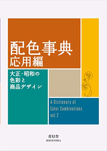
 Want the original?
Get Sanzo Wada's 1933 Dictionary on Amazon → — affiliate link; your price unchanged, small commission supports the archive. As an Amazon Associate we earn from qualifying purchases.
Want the original?
Get Sanzo Wada's 1933 Dictionary on Amazon → — affiliate link; your price unchanged, small commission supports the archive. As an Amazon Associate we earn from qualifying purchases.
Tap any of the 210 archive colors to see each documented combination it appears in — every result links to the full plate with hex values.
Pick a color above — its combinations appear here.
Studio
A palette is a set of decisions until someone mixes it. These are the materials a colour study actually gets made with.
Affiliate links — as an Amazon Associate we earn from qualifying purchases.
This site hands you hex codes. Color Bridge is the deck that shows what an RGB or HTML value becomes as CMYK ink, and which Pantone spot sits nearest it — the translation step between a screen palette and a printed one. Coated and uncoated because the same ink is not the same colour on both stocks.
Listed on Amazon as Pantone GP6102B Color Bridge Guide Set Coated & Uncoated, Multi-Colour
See price on AmazonView on AmazonPantone
The coated half on its own — Pantone to CMYK, RGB and HTML in a single fan. The smaller entry point if your work only ever goes onto coated stock.
Listed on Amazon as Pantone Color Bridge Guide Coated | Pantone to CMYK, RGB & HTML Color Matching Fan Deck for Graphic Design, Branding & Print | GG6103B
See price on AmazonView on AmazonCalibrite
A spectrophotometer profiles the whole chain — display, printer, projector, scanner — so the colour you picked is the colour that comes out the other end. The full-fidelity option for work that ends up printed.
Listed on Amazon as Calibrite ColorChecker Studio Spectrophotometer for Complete Color Management for Display, Projector, Printer and Scanner Profiling
See price on AmazonView on AmazonCalibrite
A colorimeter calibrates the monitor itself. Worth saying plainly: an uncalibrated screen is the most common reason a palette that looked right on your desk looks wrong everywhere else.
Listed on Amazon as Calibrite Video Photo Kit with Display Plus HL Colorimeter and ColorChecker Passport Video 2, 10,000 Nit Monitor Calibration, Camera Color Matching
See price on AmazonView on AmazonCalibrite
A pocket target for fixing white balance and exposure at the moment of capture — the step before any colour correction, if your palette starts from a photograph rather than a screen.
Listed on Amazon as Calibrite ColorChecker Passport Photo 2 Portable Color Calibration Kit for Photo and Video, 4 Target Set for White Balance, Exposure and Creative Look
See price on AmazonView on AmazonKuretake
Gansai are traditional Japanese watercolour pans — dense, matte and easy to mix, the closest everyday medium to the flat printed colour Wada's plates were made in. This is the Art Nouveau-themed 'II' edition, a different 24 to the standard set.
Listed on Amazon as Kuretake GANSAI TAMBI Watercolor Paint Set 24 Colors II - Art Nouveau
See price on AmazonView on AmazonKuretake
The larger pan set. More range means mixing toward a specific plate rather than approximating it from a handful of colours.
Listed on Amazon as Kuretake Gansai Tambi Watercolor Paint Set, 48 Colors, Made in Japan | 48 vivid opaque colors, non-granulating pigment, large pans, palette & color chart, Professional Use, Artist Grade
See price on AmazonView on Amazon140 lb cold press is the weight that takes a wet wash without buckling — the paper most colour studies end up on.
Listed on Amazon as Strathmore 300 Series Tape Bound Watercolor Pad, 140 lb. Cold Press, 11 X 15 inches, White, 12 Sheets (360-111)
See price on AmazonView on AmazonPentel
A felt brush tip for the labelling and linework around a swatch study — the annotation half of a colour notebook.
Listed on Amazon as Pentel Fude Touch Sign Pen, Black, Felt Pen Like Brush Stroke (SES15C-A) 3 Pieces
See price on AmazonView on AmazonWhen a palette leaves the screen, this is the shared vocabulary between you and the press. Coated and uncoated because the same ink is not the same colour on both.
Listed on Amazon as Pantone Formula Guide – Coated & Uncoated | Professional PMS Color Matching System for Print, Packaging & Graphic Design | GP1601B
See price on AmazonView on AmazonAmazon Associates affiliate links — your price is unchanged and a small commission keeps the archive free. As an Amazon Associate we earn from qualifying purchases.
Sanzo Wada (1883–1967) was a Japanese painter, teacher and colour researcher. He studied under Kuroda Seiki in Tokyo, spent 1907 to 1915 in Europe, and in 1933–34 published Haishoku Soukan, six volumes of colour combinations. In 1945 he turned the Japan Standard Color Association into the Japan Color Research Institute, and he won the Academy Award for Best Costume Design for the film Gate of Hell in 1955. His full story →
No official one. Seigensha's 2010 English edition is sold in print only, and the PDFs on file-sharing sites are unauthorised scans. Two free, legal routes exist: Wada's original 1930s volumes, scanned by Japan's National Diet Library, and all 348 combinations on this site with hex, RGB and CMYK values. What is free and where →
Editorial picks
A cross-section of the editorial set — from Heian court crimson to Edo merchant indigo — chosen because they work in real design projects today. The full 348-plate Wada catalog waits behind the browse button.
Browse by theme
Seventeen curated collections — from website palettes to sunset colors to the full Heian tradition. Every combination drawn from the same archive: 348 Wada plates plus 30 editorial palettes.
Color Palettes for Websites
Historically-grounded palettes that read well on screens at any scale.
Color Palettes for Branding
Combinations with the gravitas to carry a brand — not just a moodboard.
Autumn Color Palettes
Fallen leaves, persimmons, burnt umber, late harvest.
Summer Color Palettes
Bright yellows, warm oranges, playful pinks — the colors of light.
Green Color Palettes
Young bamboo, matcha, celadon — the green continuum of Japanese craft.
Minimalist Color Palettes
When two colors will do the work of five.
How to use this
01
Every plate from Wada's 1933 dictionary, plus editorial picks. Filter by era, hue, or mood — no login, no rate limit.
02
Hex codes, Tailwind config, CSS variables, or raw JSON. One click, no signup.
03
Every combination documented, numbered, and traceable back to its place in the original six-volume work.
Learn
Long-form articles on color theory, palette use, and the Japanese tradition behind the dictionary. Each piece links to specific palettes you can drop into a project today.
Color Report · 2026
Pantone Cloud Dancer, Benjamin Moore Silhouette, Behr Hidden Gem, and 11 more — every major authority's pick, side by side, with palettes to pair with each.
Color Report · 2027
Sherwin-Williams Celery, Dulux Soulful Sage, Behr Grounded and the other 2027 picks announced so far, side by side, with who is still to come.
Color theory · 5 min
How the Heian imperial court systematised colour into layered-robe combinations, forbidden pigments, and a 12-month seasonal calendar.
Color theory · 5 min
Why the tradition distinguishes safflower crimson from madder from vermilion from lead red — and which to reach for when the brief asks for "a Japanese red."
Color theory · 5 min
What it actually means for color when a tradition values age over newness, asymmetry over balance, and imperfection over polish.
Color theory · 5 min
How Japanese and Scandinavian traditions converge — and which palettes from the Wada dictionary actually fit the Japandi brief.
Color theory · 5 min
What Scandinavian color is beyond IKEA-white — Nordic modernism, the hygge divergence, and which palettes from the dictionary actually fit.
Reference · 12 min
Twenty traditional named colours — kurenai, akane, ai, murasaki, seiji, gofun, tobi, sumi, yamabuki, kon and more — with pigment origin and modern usage. Anchored.
From the archive
Launching soon. The free archive stays free, always.
Email updates
Join the interest list for palette sets and stories from the archive. Emails haven’t started yet.
Free. No credit card. Archive stays readable forever.
Library
The books we return to on colour theory and the language of palettes. Recommended on Amazon.
Book links are Amazon Associates affiliate links. Your price is unchanged; a small commission supports the archive. As an Amazon Associate we earn from qualifying purchases.
Torn between the two Wada dictionaries? Vol 1 vs Vol 2, compared plate by plate →
Book links are Amazon Associates affiliate links. Your price is unchanged; a small commission supports the archive. As an Amazon Associate we earn from qualifying purchases.
Tell us the colour, mood, or palette you were after — it shapes which editorial combinations we add next.
Thank you — noted for the editorial queue.