Painting palettes
Colour palettes from famous paintings
25 palettes sampled directly from the canvas of public-domain paintings — each with hex codes, WCAG contrast pairs, and CSS or Tailwind export. Every swatch is a colour that genuinely occurs in the work, never an average of two that appears nowhere in it.
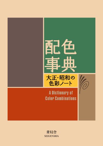 Most other palettes in this archive come from one 1933 book. Get Sanzo Wada's 1933 Dictionary on Amazon → Pocket-size paperback, about 5.9 × 4.3 in (15 × 11 cm), 256 pages, text in English and Japanese. Volume 1 of 2. Buying it as a gift? See the holiday gift guide Affiliate link; your price is unchanged. As an Amazon Associate we earn from qualifying purchases.
What makes these different
Sampled, not eyeballed
Colours are clustered in CIELAB — perceptual space, not RGB — then snapped to the nearest real pixel in the painting. Read the method.
Weighted for what you actually see
Sampling by surface area alone loses the point of a painting: van Gogh's chrome yellow is a rounding error by coverage. Three swatches record the largest areas; three are chosen for intensity.
And honest about drift
7 of these carry published conservation research on the pigments used — and on which colours have measurably changed since. The yellow problem.
-
 The Starry Night Vincent van Gogh · 1889
-
 The Bedroom Vincent van Gogh · 1889
-
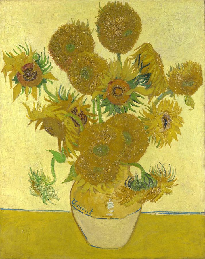 Sunflowers Vincent van Gogh · 1888 colour has shifted
-
 Café Terrace at Night Vincent van Gogh · 1888
-
 A Sunday on La Grande Jatte Georges Seurat · 1884–86 colour has shifted
-
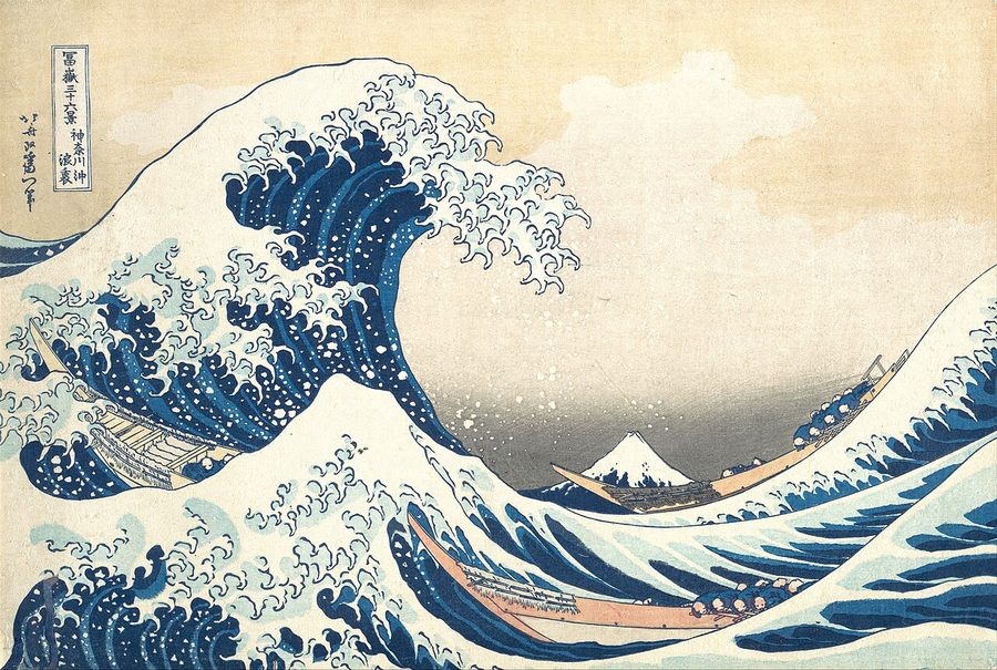 Under the Wave off Kanagawa (The Great Wave) Katsushika Hokusai · c. 1831 colour has shifted
-
 Water Lilies Claude Monet · 1906
-
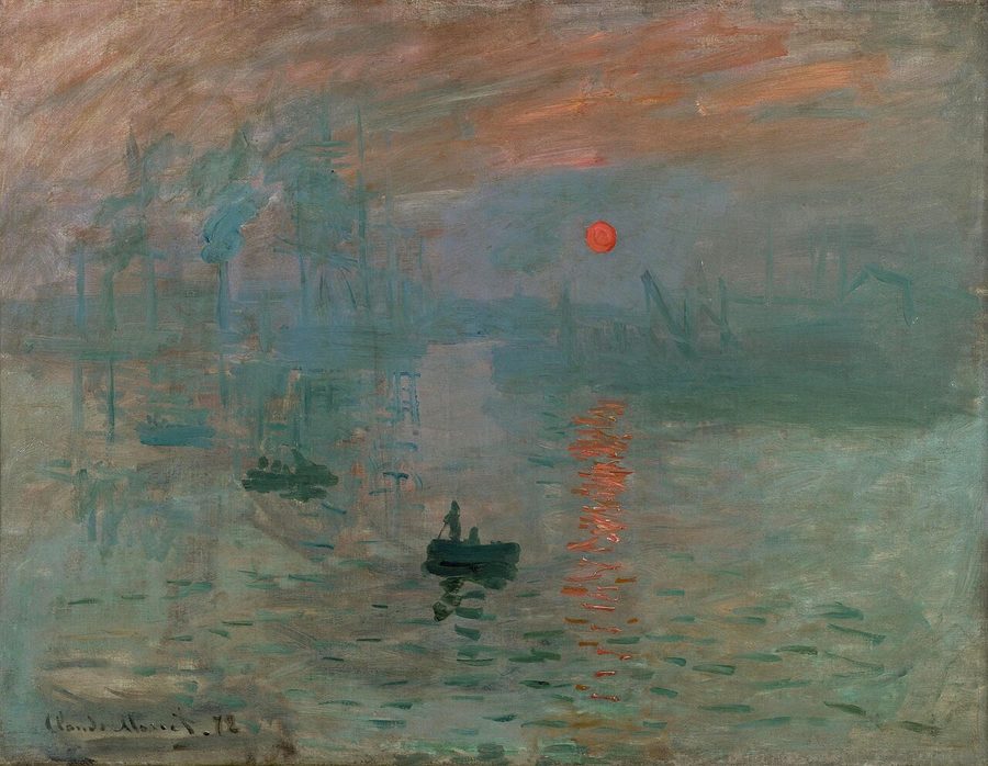 Impression, Sunrise Claude Monet · 1872
-
 Paris Street; Rainy Day Gustave Caillebotte · 1877
-
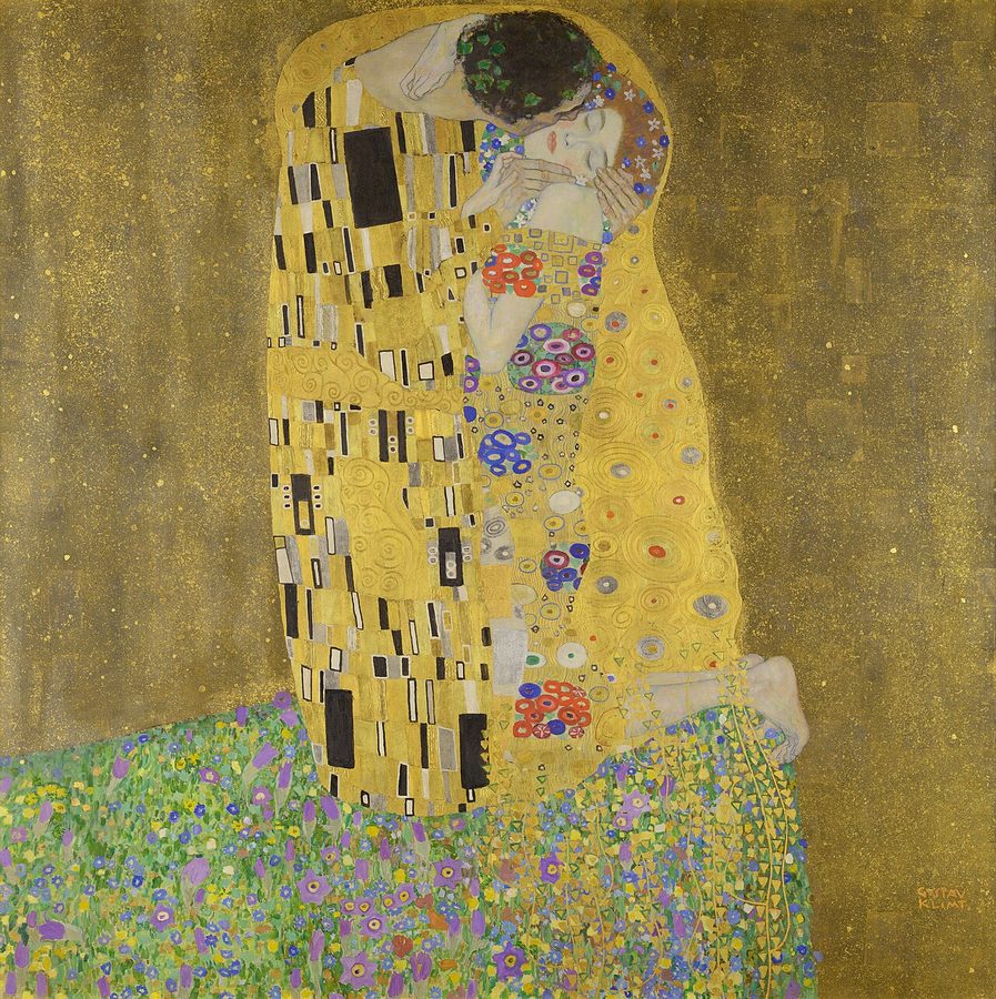 The Kiss Gustav Klimt · 1907–08 colour has shifted
-
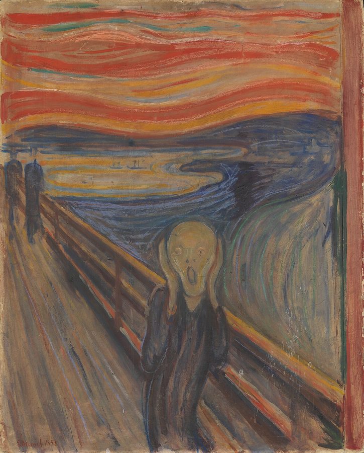 The Scream Edvard Munch · 1893 colour has shifted
-
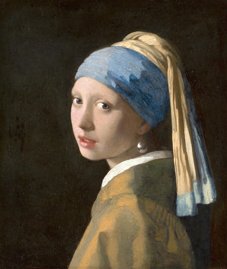 Girl with a Pearl Earring Johannes Vermeer · c. 1665 colour has shifted
-
 The Birth of Venus Sandro Botticelli · c. 1485
-
 The Night Watch Rembrandt van Rijn · 1642
-
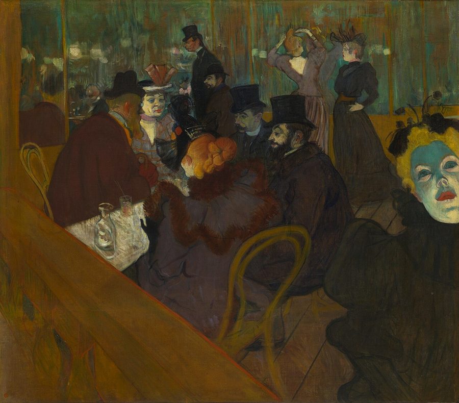 At the Moulin Rouge Henri de Toulouse-Lautrec · 1892–95
-
 The Child's Bath Mary Cassatt · 1893
-
 Two Sisters (On the Terrace) Pierre-Auguste Renoir · 1881
-
 The Fighting Temeraire J. M. W. Turner · 1839
-
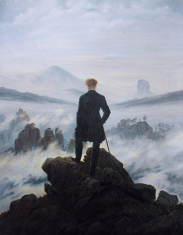 Wanderer above the Sea of Fog Caspar David Friedrich · c. 1818
-
 The Garden of Earthly Delights Hieronymus Bosch · c. 1500
-
 The Hay Wain John Constable · 1821
-
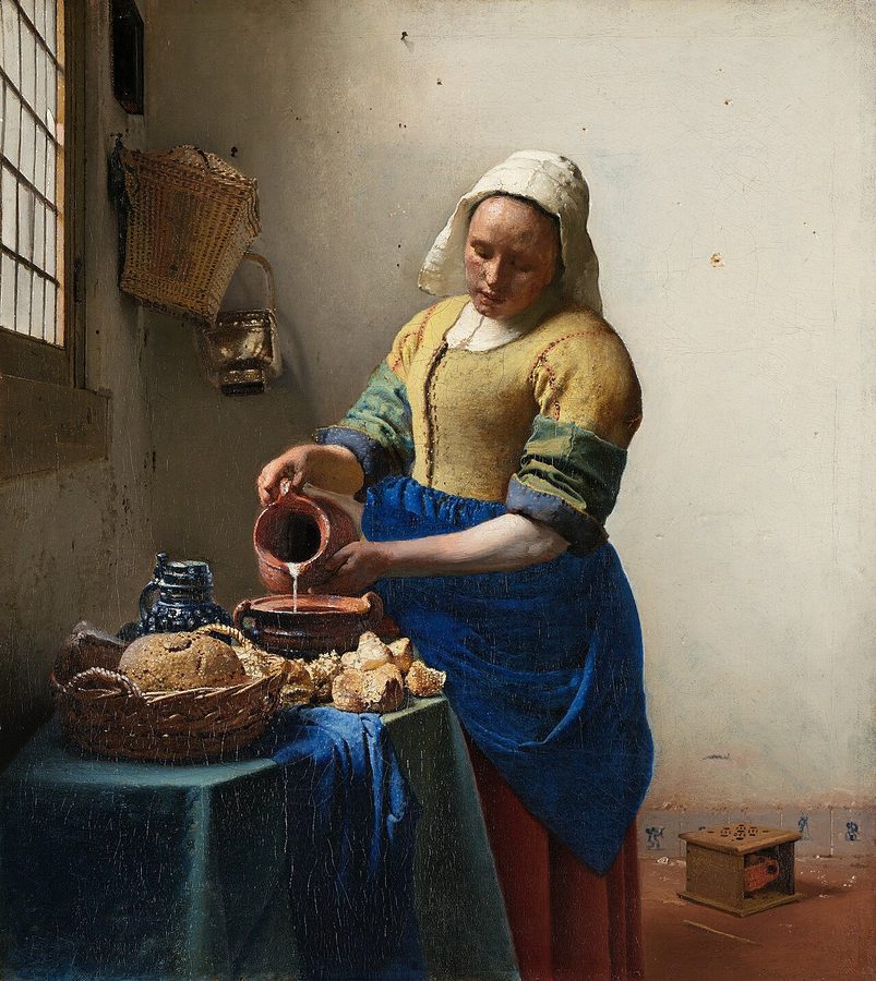 The Milkmaid Johannes Vermeer · c. 1660
-
 Ophelia John Everett Millais · 1851–52
-
 The Third of May 1808 Francisco Goya · 1814
-
 The Tower of Babel Pieter Bruegel the Elder · 1563
Studio
Paint one yourself
The palettes above came from oil and tempera. These are the materials a copy study is actually made with.
Affiliate links — as an Amazon Associate we earn from qualifying purchases.
-
Kuretake
Gansai Tambi 24 — Art Nouveau
Gansai are traditional Japanese watercolour pans — dense, matte and easy to mix, the closest everyday medium to the flat printed colour Wada's plates were made in. This is the Art Nouveau-themed 'II' edition, a different 24 to the standard set.
Listed on Amazon as Kuretake GANSAI TAMBI Watercolor Paint Set 24 Colors II - Art Nouveau
See price on AmazonView on Amazon -
Kuretake
Gansai Tambi 48
The larger pan set. More range means mixing toward a specific plate rather than approximating it from a handful of colours.
Listed on Amazon as Kuretake Gansai Tambi Watercolor Paint Set, 48 Colors, Made in Japan | 48 vivid opaque colors, non-granulating pigment, large pans, palette & color chart, Professional Use, Artist Grade
See price on AmazonView on Amazon -
Strathmore
300 Series watercolour pad, 140 lb cold press
140 lb cold press is the weight that takes a wet wash without buckling — the paper most colour studies end up on.
Listed on Amazon as Strathmore 300 Series Tape Bound Watercolor Pad, 140 lb. Cold Press, 11 X 15 inches, White, 12 Sheets (360-111)
See price on AmazonView on Amazon -
Pentel
Fude Touch brush sign pen
A felt brush tip for the labelling and linework around a swatch study — the annotation half of a colour notebook.
Listed on Amazon as Pentel Fude Touch Sign Pen, Black, Felt Pen Like Brush Stroke (SES15C-A) 3 Pieces
See price on AmazonView on Amazon
Amazon Associates affiliate links — your price is unchanged and a small commission keeps the archive free. As an Amazon Associate we earn from qualifying purchases.
Palettes elsewhere on the site
The rest of this archive is built on Sanzo Wada's 1933 Dictionary of Color Combinations — 348 plates from the six-volume Japanese original, plus editorial deep-dives. Browse all palettes or start with the thematic collections.
Last updated