Georges Seurat · 1884–86
A Sunday on La Grande Jatte
A palette that has demonstrably changed since it was painted — and was already changing while Seurat was alive.
Art Institute of Chicago
Tap any swatch to copy. Ground colours are the three largest areas of the canvas; accent colours are chosen for intensity and may cover very little — which is exactly why they carry the painting. Percentages are each colour's share of the whole canvas, so these six will not add up to 100%: they are six of the 26 distinct colour regions measured, not a division of the surface. How these were sampled

Seurat built this surface from small separate touches of colour intended to mix in the eye rather than on the palette. The extracted swatches therefore read as averages of many adjacent dots, which is closer to how the painting actually looks from across a room than any single brushstroke would be.
What makes this canvas unusual in a colour collection is that we know it has shifted, and roughly by how much. Some of the yellow-green passages have darkened toward ochre, changing the balance of the whole composition.
What the artist actually used
- Zinc yellow (zinc potassium chromate, K₂O·4ZnCrO₄·3H₂O)
- Used in the bright yellow-green passages. Chemically unstable.
- Emerald green, vermilion, cobalt blue and other modern pigments
- Seurat worked from the newly-available industrial palette of the 1880s.
Has the colour changed?
Substantially, and early. Darkening of specific brushstrokes was recorded as soon as 1892 — six years after completion. Zinc yellow moves from bright greenish-yellow toward dull ochre as Cr(VI) reduces to Cr(III); artificial ageing reproduced the effect most strongly under strong light, high humidity and sulfur dioxide. The Art Institute of Chicago and the Rochester Institute of Technology have since produced digital reconstructions of the original colour.
Sources
Accessibility
WCAG contrast ratios between every color pair. Use the strongest combinations for text; the weakest ones make good decorative backgrounds.
Strongest pair: #BEB356 on #304235 — 4.99:1 (AA)
- #BEB356·#B88862
- #BEB356·#AB594B
- #BEB356·#50526E
- #BEB356·#3F3D49
- #BEB356·#304235
- #B88862·#AB594B
- #B88862·#50526E
- #B88862·#3F3D49
- #B88862·#304235
- #AB594B·#50526E
- #AB594B·#3F3D49
- #AB594B·#304235
- #50526E·#3F3D49
- #50526E·#304235
- #3F3D49·#304235
Of the 15 pairs here: 2 clear AA for body text (4.5:1); 3 work for large or bold text only (3:1); 10 are decorative only, below 3:1.
Export
One click — no signup, no watermark.
Studio
Paint this palette
These are the materials a colour study actually gets made with.
Affiliate links — as an Amazon Associate we earn from qualifying purchases.
-
Calibrite
ColorChecker Passport Photo 2
A pocket target for fixing white balance and exposure at the moment of capture — the step before any colour correction, if your palette starts from a photograph rather than a screen.
Listed on Amazon as Calibrite ColorChecker Passport Photo 2 Portable Color Calibration Kit for Photo and Video, 4 Target Set for White Balance, Exposure and Creative Look
See price on AmazonView on Amazon -
Kuretake
Gansai Tambi 24 — Art Nouveau
Gansai are traditional Japanese watercolour pans — dense, matte and easy to mix, the closest everyday medium to the flat printed colour Wada's plates were made in. This is the Art Nouveau-themed 'II' edition, a different 24 to the standard set.
Listed on Amazon as Kuretake GANSAI TAMBI Watercolor Paint Set 24 Colors II - Art Nouveau
See price on AmazonView on Amazon -
Kuretake
Gansai Tambi 48
The larger pan set. More range means mixing toward a specific plate rather than approximating it from a handful of colours.
Listed on Amazon as Kuretake Gansai Tambi Watercolor Paint Set, 48 Colors, Made in Japan | 48 vivid opaque colors, non-granulating pigment, large pans, palette & color chart, Professional Use, Artist Grade
See price on AmazonView on Amazon
Amazon Associates affiliate links — your price is unchanged and a small commission keeps the archive free. As an Amazon Associate we earn from qualifying purchases.
Library
Further reading
Book links are Amazon Associates affiliate links. Your price is unchanged; a small commission supports the archive. As an Amazon Associate we earn from qualifying purchases.

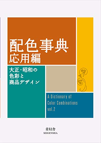

Torn between the two Wada dictionaries? Vol 1 vs Vol 2, compared plate by plate →
Book links are Amazon Associates affiliate links. Your price is unchanged; a small commission supports the archive. As an Amazon Associate we earn from qualifying purchases.