Hieronymus Bosch · c. 1500
The Garden of Earthly Delights
A 6-colour reading of The Garden of Earthly Delights, sampled from the canvas itself.
Museo del Prado, Madrid
Tap any swatch to copy. Ground colours are the three largest areas of the canvas; accent colours are chosen for intensity and may cover very little — which is exactly why they carry the painting. Percentages are each colour's share of the whole canvas, so these six will not add up to 100%: they are six of the 26 distinct colour regions measured, not a division of the surface. How these were sampled

This palette runs from #CFCFB2 at its lightest to #090806 at its darkest, with 3 accent notes carrying most of the chromatic interest. The three largest areas of the painting set the base; the accents are the colours that give the work its character without necessarily covering much of it.
Every swatch is a colour that genuinely occurs on the surface — each one is snapped to the nearest real pixel rather than averaged, so nothing here is a colour the painter never actually put down.
Accessibility
WCAG contrast ratios between every color pair. Use the strongest combinations for text; the weakest ones make good decorative backgrounds.
Strongest pair: #CFCFB2 on #090806 — 12.60:1 (AAA)
- #CFCFB2·#ACA745
- #CFCFB2·#8B852A
- #CFCFB2·#965020
- #CFCFB2·#201E14
- #CFCFB2·#090806
- #ACA745·#8B852A
- #ACA745·#965020
- #ACA745·#201E14
- #ACA745·#090806
- #8B852A·#965020
- #8B852A·#201E14
- #8B852A·#090806
- #965020·#201E14
- #965020·#090806
- #201E14·#090806
Of the 15 pairs here: 3 clear AAA for small text (7:1); 2 clear AA for body text (4.5:1); 3 work for large or bold text only (3:1); 7 are decorative only, below 3:1.
Export
One click — no signup, no watermark.
Studio
Paint this palette
These are the materials a colour study actually gets made with.
Affiliate links — as an Amazon Associate we earn from qualifying purchases.
-
Pantone
Formula Guide — coated & uncoated
When a palette leaves the screen, this is the shared vocabulary between you and the press. Coated and uncoated because the same ink is not the same colour on both.
Listed on Amazon as Pantone Formula Guide – Coated & Uncoated New Version | Professional PMS Color Matching System
See price on AmazonView on Amazon -
Pantone
Color Bridge Guide Set — coated & uncoated
This site hands you hex codes. Color Bridge is the deck that shows what an RGB or HTML value becomes as CMYK ink, and which Pantone spot sits nearest it — the translation step between a screen palette and a printed one. Coated and uncoated because the same ink is not the same colour on both stocks.
Listed on Amazon as Pantone GP6102B Color Bridge Guide Set Coated & Uncoated, Multi-Colour
See price on AmazonView on Amazon -
Pantone
Color Bridge Guide — coated
The coated half on its own — Pantone to CMYK, RGB and HTML in a single fan. The smaller entry point if your work only ever goes onto coated stock.
Listed on Amazon as Pantone Color Bridge Guide Coated | Pantone to CMYK, RGB & HTML Color Matching Fan Deck for Graphic Design, Branding & Print | GG6103B
See price on AmazonView on Amazon
Amazon Associates affiliate links — your price is unchanged and a small commission keeps the archive free. As an Amazon Associate we earn from qualifying purchases.
Library
Further reading
Book links are Amazon Associates affiliate links. Your price is unchanged; a small commission supports the archive. As an Amazon Associate we earn from qualifying purchases.
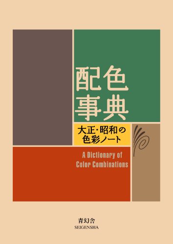
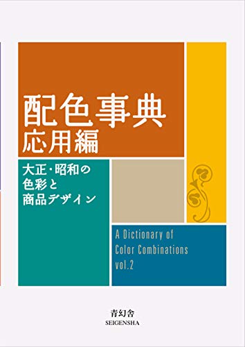

Torn between the two Wada dictionaries? Vol 1 vs Vol 2, compared plate by plate →
Book links are Amazon Associates affiliate links. Your price is unchanged; a small commission supports the archive. As an Amazon Associate we earn from qualifying purchases.