Pieter Bruegel the Elder · 1563
The Tower of Babel
A 6-colour reading of The Tower of Babel, sampled from the canvas itself.
Kunsthistorisches Museum, Vienna
Tap any swatch to copy. Ground colours are the three largest areas of the canvas; accent colours are chosen for intensity and may cover very little — which is exactly why they carry the painting. Percentages are each colour's share of the whole canvas, so these six will not add up to 100%: they are six of the 26 distinct colour regions measured, not a division of the surface. How these were sampled

This palette runs from #EDE5CD at its lightest to #964921 at its darkest, with 3 accent notes carrying most of the chromatic interest. The three largest areas of the painting set the base; the accents are the colours that give the work its character without necessarily covering much of it.
Every swatch is a colour that genuinely occurs on the surface — each one is snapped to the nearest real pixel rather than averaged, so nothing here is a colour the painter never actually put down.
Accessibility
WCAG contrast ratios between every color pair. Use the strongest combinations for text; the weakest ones make good decorative backgrounds.
Strongest pair: #EDE5CD on #964921 — 5.10:1 (AA)
- #EDE5CD·#D9D8CB
- #EDE5CD·#C69B3E
- #EDE5CD·#BA6E3A
- #EDE5CD·#7C8357
- #EDE5CD·#964921
- #D9D8CB·#C69B3E
- #D9D8CB·#BA6E3A
- #D9D8CB·#7C8357
- #D9D8CB·#964921
- #C69B3E·#BA6E3A
- #C69B3E·#7C8357
- #C69B3E·#964921
- #BA6E3A·#7C8357
- #BA6E3A·#964921
- #7C8357·#964921
Of the 15 pairs here: 1 clears AA for body text (4.5:1); 3 work for large or bold text only (3:1); 11 are decorative only, below 3:1.
Export
One click — no signup, no watermark.
Studio
Paint this palette
These are the materials a colour study actually gets made with.
Affiliate links — as an Amazon Associate we earn from qualifying purchases.
-
Calibrite
ColorChecker Passport Photo 2
A pocket target for fixing white balance and exposure at the moment of capture — the step before any colour correction, if your palette starts from a photograph rather than a screen.
Listed on Amazon as Calibrite ColorChecker Passport Photo 2 Portable Color Calibration Kit for Photo and Video, 4 Target Set for White Balance, Exposure and Creative Look
See price on AmazonView on Amazon -
Kuretake
Gansai Tambi 24 — Art Nouveau
Gansai are traditional Japanese watercolour pans — dense, matte and easy to mix, the closest everyday medium to the flat printed colour Wada's plates were made in. This is the Art Nouveau-themed 'II' edition, a different 24 to the standard set.
Listed on Amazon as Kuretake GANSAI TAMBI Watercolor Paint Set 24 Colors II - Art Nouveau
See price on AmazonView on Amazon -
Kuretake
Gansai Tambi 48
The larger pan set. More range means mixing toward a specific plate rather than approximating it from a handful of colours.
Listed on Amazon as Kuretake Gansai Tambi Watercolor Paint Set, 48 Colors, Made in Japan | 48 vivid opaque colors, non-granulating pigment, large pans, palette & color chart, Professional Use, Artist Grade
See price on AmazonView on Amazon
Amazon Associates affiliate links — your price is unchanged and a small commission keeps the archive free. As an Amazon Associate we earn from qualifying purchases.
Library
Further reading
Book links are Amazon Associates affiliate links. Your price is unchanged; a small commission supports the archive. As an Amazon Associate we earn from qualifying purchases.
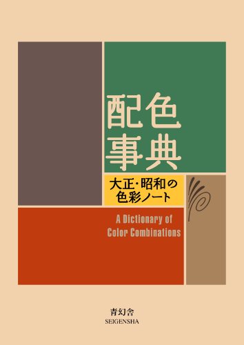
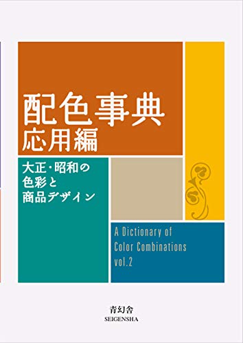

Torn between the two Wada dictionaries? Vol 1 vs Vol 2, compared plate by plate →
Book links are Amazon Associates affiliate links. Your price is unchanged; a small commission supports the archive. As an Amazon Associate we earn from qualifying purchases.