Guide
Color psychology, honestly.
Colour shapes how a design feels — but not in the tidy, universal way most articles claim. Here's what colours actually communicate in practice, framed as the cultural associations they are, not the psychological laws they aren't.
First, the honest part
If you came here for "red increases urgency by 21%," this isn't that page. The strong version of colour psychology — that a hue reliably triggers a specific emotion in everyone — is not well supported by evidence. Measured effects are small, and they're swamped by culture, context, saturation, what surrounds the colour, and personal memory.
The useful version is quieter and true: within a culture, colours carry consistent associations, and design is the craft of using those associations deliberately. A bank uses blue not because blue chemically calms you, but because — in its market — blue has come to signal stability, and meeting that expectation builds trust. Treat the guide below as a vocabulary of conventions, not a rulebook.
What each colour tends to say
Associations below are Western-design conventions. Saturation, context and culture can change or reverse them.
-
Red
Associations: Energy, urgency, appetite, passion, alarm.
Works for: Calls-to-action, sales, food, sport, anything that wants to feel immediate.
Watch out: Reads as warning or error as easily as excitement — context decides which.
-
Orange
Associations: Warmth, friendliness, affordability, playfulness, confidence.
Works for: Approachable brands, CTAs that want energy without red's aggression, youth and leisure.
Watch out: Can tip into 'cheap' or 'budget' if oversaturated.
-
Yellow
Associations: Optimism, attention, clarity, caution.
Works for: Highlights, optimism-led brands, signage — it's the most visible hue to the eye.
Watch out: Fatigues fast and can feel anxious in large fields; the hardest hue to read text on.
-
Green
Associations: Nature, health, growth, money, permission, calm.
Works for: Wellness, finance, sustainability, 'go' actions, anything organic.
Watch out: Specific greens swing between fresh (lime) and institutional (olive/forest).
-
Blue
Associations: Trust, stability, calm, competence, distance.
Works for: Finance, tech, healthcare, B2B — the default 'safe' brand colour for good reason.
Watch out: So overused for trust it can read as generic or cold; appetite-suppressing for food.
-
Purple
Associations: Luxury, creativity, spirituality, royalty, mystery.
Works for: Premium and beauty brands, creative tools, anything wanting to feel rare.
Watch out: Historically tied to wealth (the dye was costly) — can feel either opulent or new-age.
-
Pink
Associations: Playfulness, romance, modernity, energy (hot pink) or softness (pastel).
Works for: Beauty, youth, challenger brands using it to feel bold and current.
Watch out: Carries strong gendered baggage in some markets — use deliberately, not by default.
-
Brown
Associations: Earthiness, craft, reliability, warmth, the hand-made.
Works for: Artisanal, organic, heritage and outdoor brands — and squarely on-trend for 2026.
Watch out: Easily reads as dull or dated without warm light and good texture around it.
-
Black
Associations: Sophistication, authority, luxury, modernity, weight.
Works for: Premium, fashion, minimalist and tech brands; powerful for typography and contrast.
Watch out: Pure black on pure white is harsh on screens — most good 'black' is a near-black.
-
White
Associations: Cleanliness, simplicity, space, honesty, calm.
Works for: Minimalism, healthcare, premium 'breathing room', and the dominant 2026 mood.
Watch out: Negative space is a design decision, not an absence — empty ≠ finished.
-
Gray
Associations: Neutrality, balance, professionalism, restraint.
Works for: The connective tissue of almost every palette; UI, type and quiet backgrounds.
Watch out: All gray and no accent reads as indecisive or lifeless — it's a supporting role.
Context changes everything
The single biggest mistake in applying colour psychology is reading a hue in isolation. Four things move the meaning more than the hue itself:
- Saturation & lightness. A pale, dusty red whispers heritage; a pure, bright red shouts sale. Same hue, opposite message.
- Combination. Green beside gold reads as luxury; green beside brown reads as organic; green beside red reads as Christmas. Meaning lives in the pairing.
- Culture. White is purity in much of the West and mourning in parts of East Asia; red is danger in one place and luck in another. Always design for the specific audience.
- Context & expectation. The "right" CTA colour isn't red or green — it's whichever hue contrasts with the rest of your page. Standing out beats any colour myth.
A longer view: colour as a system
Long before "colour psychology" was a marketing phrase, designers treated colour as a structured language. Sanzo Wada's 1933 Dictionary of Color Combinations — the historical archive this site is built on — encoded mood through combination rather than single hues, naming hundreds of palettes for the feelings they evoke. It's a useful corrective: the emotion was never in one colour, it was in the relationships. Browse the full archive or explore curated palettes to see how historical designers built feeling out of restraint and pairing.
Library
Go deeper on colour
The books we return to on colour theory, perception and the language of palettes. Recommended on Amazon.
Book links are Amazon Associates affiliate links. Your price is unchanged; a small commission supports the archive. As an Amazon Associate we earn from qualifying purchases.

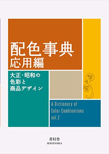


Torn between the two Wada dictionaries? Vol 1 vs Vol 2, compared plate by plate →
Book links are Amazon Associates affiliate links. Your price is unchanged; a small commission supports the archive. As an Amazon Associate we earn from qualifying purchases.
Common questions
- Is color psychology real or a myth?
- Both, in part. Strong universal 'colour X causes emotion Y' claims are not well supported by science — effects are small and heavily shaped by culture, context, saturation and personal experience. But colour associations are real and consistent enough within a culture to be a genuinely useful design tool, as long as you treat them as conventions, not laws.
- What color is best for a call-to-action button?
- There is no single best colour. What matters is contrast — the button should stand out from everything around it. A warm, saturated hue like red or orange often works because it draws the eye, but a green or blue CTA can outperform red on a page that is already warm. Test against your own palette rather than copying a rule.
- What does the color blue mean in branding?
- Blue is widely associated with trust, stability, calm and competence, which is why finance, tech and healthcare brands lean on it. The trade-off is that it is so common for 'trust' that it can read as generic, and it tends to suppress appetite, so it is a weak choice for food.
- Do colors mean the same thing in every culture?
- No. The same hue can carry opposite meanings across cultures — white signals purity in much of the West but mourning in parts of East Asia, and red means luck and celebration in China while signalling danger elsewhere. Always check colour meaning for the specific audience you are designing for.
Our approach
We present colour associations as design conventions, not scientific laws, because that's what the evidence supports. Where a strong causal claim is commonly repeated, we flag the uncertainty rather than pass it on. Swatches are representative hue samples — colour psychology operates on hue families, not exact values — and exact palette work belongs on the combination and palette pages.