Color systems
Pantone vs RAL
Two of the most-used color systems in the world — and people mix them up constantly. The short version: Pantone is for ink, RAL is for coatings. Pantone keeps a logo or a print run consistent across printers; RAL tells a factory or a painter exactly which colour to put on a wall, a window frame, or a machine. Here is the full picture.
At a glance
| Pantone (PMS) | RAL | |
|---|---|---|
| Origin | United States — Pantone Inc., 1963 | Germany — the RAL institute, 1927 |
| Built for | Print, packaging, graphic & brand design, textiles | Paints, powder coatings, plastics, architecture, industry |
| Medium | Mixed spot ink, printed on paper | Pigment in a coating, applied to a surface |
| Core collection | 2,000+ solid spot colors (plus fashion/textile TCX) | RAL Classic ~213 (Design System+ adds ~1,800) |
| Code format | Number + finish, e.g. PANTONE 185 C (coated) | Four-digit group code, e.g. RAL 3020 Traffic Red |
| Licensing | Proprietary — guides & libraries are licensed/sold | Open de-facto standard; official fan decks are sold |
| Use it for | Logos, packaging, print runs, brand consistency | Buildings, fences, machinery, signage, safety colors |
What Pantone is
The Pantone Matching System (PMS) was introduced in 1963 by Pantone Inc. in the United States. It is a spot-color system: instead of building a colour from cyan, magenta, yellow and black dots, a printer mixes a single, pre-defined ink from a recipe of base inks. That is why a Pantone colour looks the same whether it is printed in Tokyo or Toronto — everyone is mixing from the same formula.
Pantone codes are a number plus a finish suffix — PANTONE 185 C for the coated version, 185 U for uncoated paper. The solid guides cover more than two thousand colours, and separate libraries (notably the TCX cotton standards) extend the system into fashion, textiles and interiors. Pantone is what brand guidelines mean when they say “the logo is PMS 286.” The trade-off is that it is proprietary: the fan decks, formula guides and some software libraries are licensed products you buy.
What RAL is
RAL began in 1927 in Germany, created by the national institute for quality assurance to standardise the colours of varnishes and coatings. It is built for physical surfaces — powder coating, wet paint, plastics — rather than for ink on a page. When an architect specifies a window frame or a manufacturer specifies a machine housing, they reach for RAL.
The core collection, RAL Classic, holds roughly 213 colours. Each carries a four-digit code where the first digit names the colour family — 1 yellow, 2 orange, 3 red, 4 violet, 5 blue, 6 green, 7 grey, 8 brown, 9 white/black — so RAL 5010 is a blue (Gentian Blue) and RAL 9005 is a black (Jet Black). Two larger systems extend it: RAL Design System+, with around 1,800 colours arranged by hue, lightness and chroma, and RAL Effect, which adds metallics. RAL also defines the standard safety and signal colours used across European industry.
The real difference
The two systems are not competitors so much as tools for different jobs. Pantone lives in the world of print and brand — graphic design, packaging, marketing. RAL lives in the world of made objects and built spaces — coatings, architecture, manufacturing. Because one is ink on paper and the other is pigment on a surface, the same name in each system rarely describes an identical colour, and the ranges are sized to their purpose: Pantone is broad because brands want nuance; RAL Classic is deliberately small because a coatings supplier wants a tight, repeatable, orderable set.
Which should you use?
- Designing a logo, packaging or a print piece? Use Pantone. A spot colour is the most reliable way to keep a brand colour consistent across printers and materials.
- Specifying paint, powder coating or a building element — especially in Europe? Use RAL. A code like RAL 7016 (Anthracite Grey) is understood by every coater and supplier on the continent.
- Working digitally — web, UI, screen? Neither, strictly. Both are physical standards; for screen work you want HEX, RGB or a perceptual model. (We compare those in our color-model guides.)
Can you convert between them?
Approximately, yes — there are published cross-reference charts that pair a Pantone colour with its nearest RAL match and vice versa. But treat them as a starting point, never a guarantee. Different media, different pigments and different gamuts mean the “equivalent” can shift in person. Before any production run, sign off on a physical sample in the actual material and finish.
Questions, answered
- What is the difference between Pantone and RAL?
- Pantone is a US, ink-based spot-color system built for print, packaging, and brand design. RAL is a European system built for paints, powder coatings, plastics, and architectural or industrial surfaces. They serve different media, so they are not directly interchangeable.
- Can you convert Pantone to RAL?
- Only approximately. Pantone is mixed ink printed on paper; RAL is pigment in a coating on a physical surface. Cross-reference charts give the nearest visual match, not an exact equivalent — always confirm against a physical sample before committing to production.
- How many colors does each system have?
- RAL Classic holds around 213 colors, and RAL Design System+ adds roughly 1,800 more arranged by hue, lightness, and chroma. Pantone's solid (spot) guides cover more than 2,000 colors, with thousands more across its fashion, textile, and interiors (TCX) libraries.
- Which is better for a logo or branding?
- Pantone. It is the global standard for print and packaging, so specifying a Pantone spot color means a logo reproduces consistently across different printers and materials anywhere in the world.
- Which is better for painting a building, fence, or machine?
- RAL. It is the European standard for architectural and industrial coatings, so a code like RAL 9005 tells any powder-coater or paint supplier exactly which black to mix and apply.
- Is RAL or Pantone free to use?
- RAL codes are a widely published, de-facto open standard you can reference freely, though official RAL fan decks are sold. Pantone is proprietary: the matching system is licensed and the physical guides — and some software color libraries — must be purchased.
Library
Go deeper on colour
Systems like Pantone and RAL are the practical surface. These are the books on the theory, history and craft of colour underneath them.
Book links are Amazon Associates affiliate links. Your price is unchanged; a small commission supports the archive. As an Amazon Associate we earn from qualifying purchases.

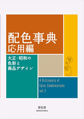


Torn between the two Wada dictionaries? Vol 1 vs Vol 2, compared plate by plate →
Book links are Amazon Associates affiliate links. Your price is unchanged; a small commission supports the archive. As an Amazon Associate we earn from qualifying purchases.