Design systems
Material Design Color: M2 vs M3
Google rebuilt Material's color system from the ground up in 2021. Material 2 gives you a fixed palette of 19 hues to choose from; Material 3 generates an entire theme from a single seed color. Here's what changed, what HCT actually is, and how to turn one of this archive's plates into a working Material 3 theme.
At a glance
| Material 2 | Material 3 | |
|---|---|---|
| Introduced | 2014 | 2021, alongside Android 12 (“Material You”) |
| Color model | Fixed palette — 19 named hues | Dynamic — generated from any seed color |
| Underlying space | No formal color space; hand-picked swatches | HCT (Hue, Chroma, Tone) — built on CAM16 + CIELAB L* |
| Base structure | Primary hue + accent hue (2 choices) | Primary / secondary / tertiary / neutral / neutral-variant / error (6 tonal palettes) |
| Tonal stops per hue | 10 (50–900) + 4 accent (A100–A700) | 13 (0, 10, 20… 90, 95, 99, 100) |
| Personalization | Same palette across every app | Can derive from device wallpaper or one brand seed color |
| Primary tool | Static Material color swatches | Material Theme Builder (Figma plugin + web app) |
| Best for | Fixed brand systems, legacy Android/web | Adaptive theming with light/dark parity |
Material 2: a fixed, 19-hue palette
The original Material Design color system (2014) ships as a
closed set of 19 named hues — Red, Pink, Purple,
Deep Purple, Indigo, Blue, Light Blue, Cyan, Teal, Green, Light
Green, Lime, Yellow, Amber, Orange, Deep Orange, Brown, Grey, Blue
Grey — each supplied as a ten-step scale from 50
(near-white) to 900 (near-black), with several also
offering four punchier accent variants (A100–A700).
You build a brand by picking one hue as your primary and another as
your accent. It's simple, well-tested, and completely static: every
app using Material 2's Indigo 500 shows the exact same blue.
Material 3: dynamic color, built on HCT
Material 3 (2021, launched with Material You on Android 12) inverts the model. Instead of choosing from a fixed menu, you hand it one seed color — a brand hex, or on Android, a color extracted from the user's wallpaper — and the system derives everything else. It does this in HCT (Hue, Chroma, Tone), a color space Google built specifically for this purpose by combining the perceptual hue/chroma attributes of the CAM16 color-appearance model with the L* lightness channel from CIELAB. HCT lets the system hold hue and chroma fixed while sweeping tone smoothly from black to white, producing tonal palettes that read as evenly graduated to a human eye.
From one seed, Material 3 generates six tonal
palettes (primary, secondary, tertiary, neutral,
neutral-variant, error), each with 13 stops
(0, 10, 20… 90, 95, 99, 100). Roles — primary,
on-primary, primary-container,
on-primary-container, and their equivalents for every
other palette — are then assigned fixed tone values from those
ramps, separately for light and dark schemes, which is what gives M3
apps automatic, contrast-safe dark mode without a designer hand-tuning
every color a second time.
Seed a Material 3 theme from a Wada plate
Because the whole system only needs one hex value to start, any
palette in this archive can become a Material 3 seed. Take
English Red & Cerulian Blue, the first plate in the archive:
its most saturated swatch is #d96629 (English Red). Paste
that hex into the Material Theme Builder —
Google's official tool, shipped as a Figma plugin and as a web app at
m3.material.io/theme-builder — and it computes the
full six-palette, light-and-dark theme in seconds, exportable to
Android XML, Jetpack Compose, CSS custom properties, or Figma
variables. The most saturated swatch in a palette is the better seed
choice: a near-neutral seed produces a flatter tonal ramp with less
contrast between the generated roles.
Which should you use?
- Building a static brand system, or targeting older Android/web? Material 2's fixed palette is simpler to reason about and doesn't require a theme-generation step.
- Want automatic, contrast-safe dark mode from one brand color? Material 3's dynamic color does that derivation for you.
- Designing per-user or per-wallpaper theming? Only Material 3's HCT-based generation supports that — Material 2 has no mechanism for deriving a palette from arbitrary input.
Questions, answered
- What's the difference between Material 2 and Material 3 color?
- Material 2 (2014–2021) ships a fixed palette: 19 named hues (Red, Indigo, Teal, and so on), each provided as a 10-step scale from 50 to 900 plus optional A100–A700 accents. You pick a primary and an accent hue from that fixed set. Material 3 (2021, 'Material You') replaces this with dynamic color: you provide any single seed color, and Google's HCT (Hue, Chroma, Tone) system generates a full set of tonal palettes and role assignments from it — the palette is derived, not chosen from a menu.
- What is HCT and why did Google build it?
- HCT stands for Hue, Chroma, Tone. It's a color space Google built specifically for Material 3, combining perceptual attributes from CAM16 (a color-appearance model) with the L* lightness channel from CIELAB. The goal is a space where you can hold hue and chroma constant while sweeping tone (lightness) and get colors that look evenly graduated to a human eye — which is what a usable light/dark tonal palette needs.
- How many tonal stops does a Material 3 palette have?
- Thirteen: 0, 10, 20, 30, 40, 50, 60, 70, 80, 90, 95, 99 and 100 — 0 is pure black, 100 is pure white, and the app generates one such 13-stop ramp for each of six roles: primary, secondary, tertiary, neutral, neutral-variant and error.
- What is the Material Theme Builder?
- It's Google's official tool for generating an M3 theme — available as a Figma plugin and as a web app at m3.material.io/theme-builder. You paste in one seed color (or up to one per role, for finer control), and it computes the full set of tonal palettes and role assignments for both light and dark schemes, exportable to Android XML, Jetpack Compose, CSS custom properties, or Figma variables.
- Can I use a historical color palette as a Material 3 seed?
- Yes — the Theme Builder only needs one hex value per role. Any palette with a clear dominant color works; pick its most saturated swatch as the seed, since a near-neutral or muted seed produces a flatter tonal ramp with less contrast between roles.
- Is Material 2 still supported?
- Yes. Material 2 components and the fixed palette still ship in current Material libraries for teams that need a static brand system rather than per-user dynamic theming — it's a design choice, not a deprecated one.
Toolbox
Tools for building the theme
Once you have a seed color, these are the tools that take it the rest of the way — into a Figma theme, a production app, or a client deliverable.
-
design
Adobe Creative Cloud
Industry-standard design suite: Photoshop, Illustrator, InDesign, XD.
Every Wada palette exports cleanly into Adobe color-book format. If you bill clients, Adobe is the default deliverable they expect.
-
design
Figma
The default design tool. Free tier is generous.
The tokens bundle includes a drag-in Figma file. Free tier handles most solo work.
-
design
Canva
Drag-and-drop design for non-designers — social, presentations, brand kits.
Pair a Wada palette with a Canva brand kit and your client's marketing has a coherent visual identity in 20 minutes.
-
prototype
Framer
Design tool + no-code site builder. Publishes straight to the web.
If you want the palettes as a live brand system with a working site, Framer gets there without leaving the canvas.
-
design
Tailwind UI
Premium component library by the Tailwind team. Production-ready blocks.
Drop a Wada palette into Tailwind UI's components and ship a brand-coherent site in a day. The CSS-vars export from this archive plugs straight into Tailwind config.
-
color
Coolors
Palette generator with contrast checker and exports.
Complements this archive — use Coolors for iteration, use the archive for provenance.
-
color
Khroma
AI-trained on your color preferences — generates palettes you would have picked.
Pair Khroma's per-user generation with the Wada archive's historical depth for a complete colour-picking workflow.
Library
Go deeper on color systems
Design-system color owes a lot to color theory that predates any of these tools. These are the books on why palettes work, not just how to generate one.
Book links are Amazon Associates affiliate links. Your price is unchanged; a small commission supports the archive. As an Amazon Associate we earn from qualifying purchases.
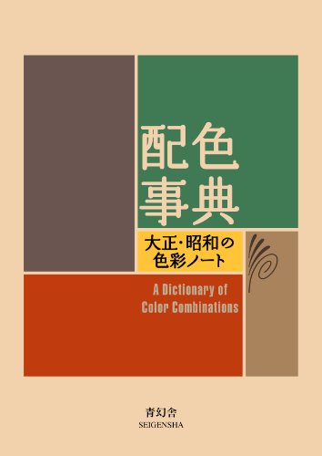
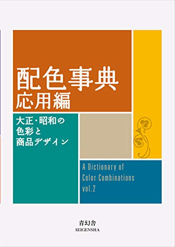


Torn between the two Wada dictionaries? Vol 1 vs Vol 2, compared plate by plate →
Book links are Amazon Associates affiliate links. Your price is unchanged; a small commission supports the archive. As an Amazon Associate we earn from qualifying purchases.