Named references

Six books worth owning outright.

The archive stays free — every plate, every hex value, no login. This shelf is different from the general shop: it is the reading list for someone who already knows they want a Sanzo Wada dictionary on the desk, an Albers for the studio, or the field guide built on Munsell's own notation. Six works, none of them out of print, none of them duplicated on this page for padding.

Library

The reference shelf

Six works, chosen for what they do that the free archive doesn't: a printed original, a working theory, a system of notation, a design history, a precedent a century older than Wada's.

  • A Dictionary of Color Combinations by Sanzo Wada — book cover

    Sanzo Wada

    A Dictionary of Color Combinations

    Seigensha, 2010 reprint of the 1933 original. Japanese import.

    The book this entire archive is a digitisation of — 348 combinations, organised by tone rather than hue, the way a working colourist actually sorts them. Every plate is free to browse here; this is the printed original, matte Seigensha binding and all.

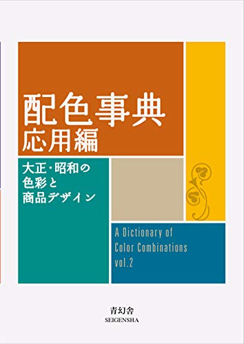
  • A Dictionary of Color Combinations Vol. 2 by Sanzo Wada — book cover

    Sanzo Wada

    A Dictionary of Color Combinations Vol. 2

    Seigensha, 2020. Japanese import.

    Wada's 1935-1938 follow-up sets — 237 further plates across seasonal, fashion, interior and graphic-design colourways — none of them digitised in this archive, so this volume is the only place to see them.

  • Interaction of Color by Josef Albers — book cover

    Josef Albers

    Interaction of Color

    50th Anniversary Edition, Yale University Press.

    Wada catalogues what combinations look like; Albers explains why they behave the way they do — the same colour reading as three different values depending on what sits next to it. The exercises are still how art schools teach relational colour.

  • Color and Light: A Guide for the Realist Painter by James Gurney — book cover

    James Gurney

    Color and Light: A Guide for the Realist Painter

    Andrews McMeel, 2010.

    Not written by Munsell, and honestly billed as such: this is the working painter's field guide to his hue/value/chroma notation — the version of the Munsell system actually used at an easel rather than in a lab, from an artist who paints for a living.

  • Pantone: The Twentieth Century in Color by Leatrice Eiseman & Keith Recker — book cover

    Leatrice Eiseman & Keith Recker

    Pantone: The Twentieth Century in Color

    Chronicle Books, 2011.

    The Pantone Color Institute's own decade-by-decade account of how colour moved through design, advertising and product from 1900 to 2000 — a reference for tracing a palette back to the decade it belongs to.

  • Werner's Nomenclature of Colours by Patrick Syme (after Abraham Gottlob Werner) — book cover

    Patrick Syme (after Abraham Gottlob Werner)

    Werner's Nomenclature of Colours

    Smithsonian Books, 2018 facsimile of the 1821 edition.

    The dictionary that came a century before Wada's — Syme matched 110 named colours to birds, minerals and plants so naturalists in the field could describe what they saw precisely. Darwin carried a copy on the Beagle. The same instinct as this whole archive, just 1821's version of it.

Torn between the two Wada dictionaries? Vol 1 vs Vol 2, compared plate by plate →

Book links are Amazon Associates affiliate links. Your price is unchanged; a small commission supports the archive. As an Amazon Associate we earn from qualifying purchases.

Why these six

Wada's own dictionary — both volumes — is the obvious anchor: this whole site is a digitisation of Vol. 1, and Vol. 2's plates aren't in it. Albers explains the relational effect Wada's plates only show. Gurney's field guide is the practical, working-painter's route into Munsell's hue/value/chroma notation, honestly billed as a guide built on the system rather than written by Munsell himself. Pantone's own history traces the twentieth century in colour. And Werner's 1821 nomenclature — the book Darwin carried on the Beagle — is the same instinct as this whole archive, a full century before Wada's version of it.

Not every colour book belongs here — the general shelf on the shop page covers wider ground. This one is deliberately six, deliberately named, deliberately references rather than survey reading.

Looking for a combination we don’t have yet?

Tell us the colour, mood, or palette you were after — it shapes which editorial combinations we add next.