Colors that go with Dusty Rose for a kitchen
Dusty Rose · #C08081
Dusty Rose (#C08081) — a muted, greyed pink — is best for a kitchen with terracotta & clay, ochre & gold, green, and muted red. In a kitchen, contrast it with terracotta & clay, drawn from 8 historically-grounded combinations below.
Kitchens pair best with warm, durable partners — colors that read clean against cabinetry and counters in hard task lighting.
About dusty rose
Dusty Rose is a muted, greyed pink — a gently muted, warm colour that reads as mid-toned. As a warm tone it looks most resolved next to cool and neutral partners that temper its warmth, and it needs both lighter and deeper shades nearby for the value contrast the eye reads as finished. That balance is what makes it feel earthy in a kitchen.
- HEX
- #C08081
- RGB
- 192, 128, 129
- HSL
- 359°, 34%, 63%
- CMYK
- 0, 33, 33, 25
Accessibility: put light text on dusty rose for AA for large text legibility (contrast 3:1 against off-white).
Why dusty rose pairs with terracotta & clay, ochre & gold, green, and muted red
Across the 8 historical combinations below, dusty rose sits most often beside terracotta & clay, ochre & gold, green, and muted red. That tracks with colour theory: a warm, mid-toned tone like this one wants cool and neutral partners that temper its warmth so the scheme feels intentional rather than flat, and both lighter and deeper partners supply the light-to-dark range the eye needs. Kitchens pair best with warm, durable partners — colors that read clean against cabinetry and counters in hard task lighting.
- terracotta & clay
- ochre & gold
- green
- muted red
Using dusty rose in a kitchen
In a kitchen, contrast it with terracotta & clay and ochre & gold. Because dusty rose is mid-toned, it can cover larger surfaces, with muted red added for depth.
8 combinations with dusty rose, from the 1933 Dictionary
Light Brown Drab & Etruscan Red +1
Plate 185 from Sanzo Wada's 1933 Dictionary of Color Combinations — Light Brown Drab, Etruscan Red, Pale Lemon Yellow.
#b59392 #c55347 #ffefae
Light Brown Drab & Yellow Ocher +1
Plate 191 from Sanzo Wada's 1933 Dictionary of Color Combinations — Light Brown Drab, Yellow Ocher, Blue.
#b59392 #e2b540 #006eb8
Light Brown Drab & Ochraceous Salmon +1
Plate 223 from Sanzo Wada's 1933 Dictionary of Color Combinations — Light Brown Drab, Ochraceous Salmon, Turquoise Green.
#b59392 #d8a37b #b5decc
Light Brown Drab & Pyrite Yellow +1
Plate 239 from Sanzo Wada's 1933 Dictionary of Color Combinations — Light Brown Drab, Pyrite Yellow, Glaucous Green.
#b59392 #cab356 #b4cdc2
Light Brown Drab & Vinaceous Tawny +2
Plate 244 from Sanzo Wada's 1933 Dictionary of Color Combinations — Light Brown Drab, Vinaceous Tawny, Andover Green, Antwarp Blue.
#b59392 #c56127 #6d7e77 #007190
Light Brown Drab & Raw Sienna +2
Plate 268 from Sanzo Wada's 1933 Dictionary of Color Combinations — Light Brown Drab, Raw Sienna, Deep Slate Olive, Nile Blue.
#b59392 #bb7125 #253122 #bce4e5
Light Brown Drab & Burnt Sienna +2
Plate 285 from Sanzo Wada's 1933 Dictionary of Color Combinations — Light Brown Drab, Burnt Sienna, Peach Red, Turquoise Green.
#b59392 #ae5224 #f15a30 #b5decc
Light Brown Drab & Sulpher Yellow +2
Plate 321 from Sanzo Wada's 1933 Dictionary of Color Combinations — Light Brown Drab, Sulpher Yellow, Deep Slate Olive, Salvia Blue.
#b59392 #f5ecc2 #253122 #97acc8
Questions about Dusty Rose for a kitchen
What colors go with dusty rose for a kitchen?
Dusty Rose (#C08081) — a muted, greyed pink — is best for a kitchen with terracotta & clay, ochre & gold, green, and muted red. In a kitchen, contrast it with terracotta & clay, drawn from 8 historically-grounded combinations below.
What is the hex code for dusty rose?
Dusty Rose is #C08081 — a muted, greyed pink.
Does dusty rose go with white?
Yes. Dusty Rose reads clean against soft white and cream; for contrast, add one of: terracotta & clay, ochre & gold, green, muted red.
Dusty Rose in other settings
Other colors
Studio
Work with this pairing
You have the hex codes for Dusty Rose for a kitchen. These are the materials a colour study like this actually gets made with.
-
140 lb cold press is the weight that takes a wet wash without buckling — the paper most colour studies end up on.
Listed on Amazon as Strathmore 300 Series Tape Bound Watercolor Pad, 140 lb. Cold Press, 11 X 15 inches, White, 12 Sheets (360-111)
View on Amazon -
Pentel
Fude Touch brush sign pen
A felt brush tip for the labelling and linework around a swatch study — the annotation half of a colour notebook.
Listed on Amazon as Pentel Fude Touch Sign Pen, Black, Felt Pen Like Brush Stroke (SES15C-A) 3 Pieces
View on Amazon
Amazon Associates affiliate links — your price is unchanged and a small commission keeps the archive free. As an Amazon Associate we earn from qualifying purchases.
From the archive
Support the archive The full catalog, on your disk, as a thank-you.
- All 378 palettes (348 Wada + 30 editorial) in five formats
- Figma design tokens (W3C-spec JSON, drag into any file)
- Tailwind v4 + v3 configs — drop into any project
- CSS custom properties — every plate, one stylesheet
- 378 museum SVG plates — print-ready at any size
- Full JSON — colors, names, eras, moods, dominant hues
Launching soon. The free archive stays free, always.
Library
Go deeper on colour
The colour-theory books behind pairings like Dusty Rose — history, reference and the science of what works together.
Book links are Amazon Associates affiliate links. Your price is unchanged; a small commission supports the archive. As an Amazon Associate we earn from qualifying purchases.

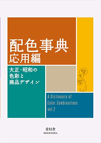


Torn between the two Wada dictionaries? Vol 1 vs Vol 2, compared plate by plate →
Book links are Amazon Associates affiliate links. Your price is unchanged; a small commission supports the archive. As an Amazon Associate we earn from qualifying purchases.