Heian era
Crimson & Navy— 紅と紺
Deep safflower crimson against navy — the courtly contrast of Heian-era robes and formal Edo textiles.
All combinations
Filter by historical era, dominant hue, or mood. Click any palette to see its story, copy the hex values, or download as JSON.
Looking for something specific? See every 2026 Color of the Year — Pantone, Benjamin Moore, Behr and more, side by side.
Showing 378 of 378 palettes
Library
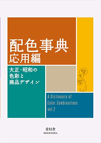
The books behind the dictionary — colour theory, history and the references designers keep close. Recommended on Amazon.
Torn between the two Wada dictionaries? Vol 1 vs Vol 2, compared plate by plate →
Book links are Amazon Associates affiliate links. Your price is unchanged; a small commission supports the archive. As an Amazon Associate we earn from qualifying purchases.
Studio
Browsing 348 palettes is one way to study colour. Actually mixing one is another — these are the materials that get a study made.
Pantone
This site hands you hex codes. Color Bridge is the deck that shows what an RGB or HTML value becomes as CMYK ink, and which Pantone spot sits nearest it — the translation step between a screen palette and a printed one. Coated and uncoated because the same ink is not the same colour on both stocks.
View on AmazonPantone
The coated half on its own — Pantone to CMYK, RGB and HTML in a single fan. The smaller entry point if your work only ever goes onto coated stock.
View on AmazonCalibrite
A spectrophotometer profiles the whole chain — display, printer, projector, scanner — so the colour you picked is the colour that comes out the other end. The full-fidelity option for work that ends up printed.
View on AmazonCalibrite
A colorimeter calibrates the monitor itself. Worth saying plainly: an uncalibrated screen is the most common reason a palette that looked right on your desk looks wrong everywhere else.
View on AmazonCalibrite
A pocket target for fixing white balance and exposure at the moment of capture — the step before any colour correction, if your palette starts from a photograph rather than a screen.
View on AmazonKuretake
Gansai are traditional Japanese watercolour pans — dense, matte and easy to mix, the closest everyday medium to the flat printed colour Wada's plates were made in. This is the Art Nouveau-themed 'II' edition, a different 24 to the standard set.
View on AmazonKuretake
The larger pan set. More range means mixing toward a specific plate rather than approximating it from six colours.
View on AmazonStrathmore
140 lb cold press is the weight that takes a wet wash without buckling — the paper most colour studies end up on.
View on AmazonPentel
A felt brush tip for the labelling and linework around a swatch study — the annotation half of a colour notebook.
View on AmazonPantone
When a palette leaves the screen, this is the shared vocabulary between you and the press. Coated and uncoated because the same ink is not the same colour on both.
View on AmazonAmazon Associates affiliate links — your price is unchanged and a small commission keeps the archive free. As an Amazon Associate we earn from qualifying purchases.
Tell us the colour, mood, or palette you were after — it shapes which editorial combinations we add next.
Thank you — noted for the editorial queue.