Colors That Go With Orange
#E8833A · a warm, vivid orange
Orange goes best with teal or terracotta & clay, the partners that appear most often in the top archive matches below. For contrast, try slate & blue (#4d97cb), its complementary accent. Orange (#E8833A), a warm, vivid orange, is a warm, saturated mid-toned colour, with 962 historically-grounded combinations across 13 settings.
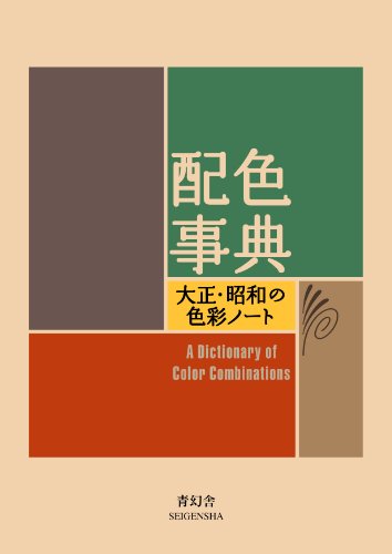 Most combinations in this archive come from one 1933 book. Get Sanzo Wada's 1933 Dictionary on Amazon → Pocket-size paperback, about 5.9 × 4.3 in (15 × 11 cm), 256 pages, text in English and Japanese. Volume 1 of 2. Buying it as a gift? See the holiday gift guide Affiliate link; your price is unchanged. As an Amazon Associate we earn from qualifying purchases.
Colour reference
- Hex
- #E8833A
- RGB
- 232, 131, 58
- CMYK
- 0, 44, 75, 9
- Temperature
- warm
- Lightness
- mid-toned (57%)
- Contrast with near-black text
- 6.4:1 (AA)
Orange by setting
Orange for walls
On walls, use teal. 74 matching combinations.
Orange for a wedding
For a wedding, pair it with green. 74 matching combinations.
Orange for a bedroom
In a bedroom, layer it with green. 74 matching combinations.
Orange for a living room
In a living room, ground it with deep charcoal. 74 matching combinations.
Orange for a kitchen
In a kitchen, contrast it with deep charcoal. 74 matching combinations.
Orange for clothes
To wear with it, reach for teal. 74 matching combinations.
Orange for an outfit
Build the outfit around teal. 74 matching combinations.
Orange for cabinets
With cabinets, match it to muted red. 74 matching combinations.
Orange for a bathroom
In a bathroom, pair it with green. 74 matching combinations.
Orange for a nursery
In a nursery, soften it with green. 74 matching combinations.
Orange for a front door
On a front door, contrast it with deep charcoal. 74 matching combinations.
Orange for an accent wall
On an accent wall, pair it with teal. 74 matching combinations.
Orange for curtains
For curtains, choose deep charcoal. 74 matching combinations.
Combinations with orange, from the 1933 Dictionary
Sulpher Yellow & Yellow Orange +1
Plate 151 from Sanzo Wada's 1933 Dictionary of Color Combinations — Sulpher Yellow, Yellow Orange, Vandar Poel's Blue.
Ivory Buff, Yellow Orange & Salvia Blue
Plate 209 from Sanzo Wada's 1933 Dictionary of Color Combinations — Ivory Buff, Yellow Orange, Salvia Blue.
Cream Yellow & Yellow Orange +2
Plate 267 from Sanzo Wada's 1933 Dictionary of Color Combinations — Cream Yellow, Yellow Orange, Benzol Green, Blue.
Pale Lemon Yellow & Orange +2
Plate 272 from Sanzo Wada's 1933 Dictionary of Color Combinations — Pale Lemon Yellow, Orange, Turquoise Green, Salvia Blue.
Bitter Orange & Navy
The sharp orange of the daidai citrus set off by deep indigo navy.
Lapis & Chalk
Lapis lazuli blue against oyster-shell white — the color of Buddhist scripture.
FAQ
What colors go with orange?
Orange goes best with teal or terracotta & clay, the partners that appear most often in the top archive matches below. For contrast, try slate & blue (#4d97cb), its complementary accent. Orange (#E8833A), a warm, vivid orange, is a warm, saturated mid-toned colour, with 962 historically-grounded combinations across 13 settings.
Is orange warm or cool?
Orange is a warm colour — 79% saturation, 57% lightness. Balance it with #ce5469 or another cool/neutral partner.
What is the hex code for orange?
Orange is #E8833A — RGB(232, 131, 58), CMYK(0, 44, 75, 9).
Other colors
Studio
Work with this colour
You have the hex code, the RGB/CMYK values and the computed partners for Orange. These are the materials a colour study like this actually gets made with.
Affiliate links — as an Amazon Associate we earn from qualifying purchases.
-
Kuretake
Gansai Tambi 48
The larger pan set. More range means mixing toward a specific plate rather than approximating it from a handful of colours.
Listed on Amazon as Kuretake Gansai Tambi Watercolor Paint Set, 48 Colors, Made in Japan | 48 vivid opaque colors, non-granulating pigment, large pans, palette & color chart, Professional Use, Artist Grade
See price on AmazonView on Amazon -
Strathmore
300 Series watercolour pad, 140 lb cold press
140 lb cold press is the weight that takes a wet wash without buckling — the paper most colour studies end up on.
Listed on Amazon as Strathmore 300 Series Tape Bound Watercolor Pad, 140 lb. Cold Press, 11 X 15 inches, White, 12 Sheets (360-111)
See price on AmazonView on Amazon
Amazon Associates affiliate links — your price is unchanged and a small commission keeps the archive free. As an Amazon Associate we earn from qualifying purchases.
From the archive
Support the archive The full catalog, on your disk, as a thank-you.
- All 378 palettes (348 Wada + 30 editorial) in five formats
- Figma design tokens (W3C-spec JSON, drag into any file)
- Tailwind v4 + v3 configs — drop into any project
- CSS custom properties — every plate, one stylesheet
- 378 SVG plates (348 Wada + 30 editorial) — print-ready at any size
- Full JSON — colors, names, eras, moods, dominant hues
Not on sale yet: join the list for one email when it opens. The free archive stays free, always.
Library
Go deeper on colour
The colour-theory books behind pairings like Orange — history, reference and the science of what works together.
Book links are Amazon Associates affiliate links. Your price is unchanged; a small commission supports the archive. As an Amazon Associate we earn from qualifying purchases.


Book links are Amazon Associates affiliate links. Your price is unchanged; a small commission supports the archive. As an Amazon Associate we earn from qualifying purchases.
Last updated