Colors that go with Orange for clothes
Orange · #E8833A
Orange (#E8833A) — a warm, vivid orange — is best for clothes with teal, deep charcoal, muted red, and terracotta & clay. To wear with it, reach for teal, drawn from 8 historically-grounded combinations below.
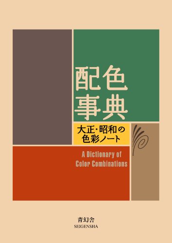 Most combinations in this archive come from one 1933 book. Get Sanzo Wada's 1933 Dictionary on Amazon → Pocket-size paperback, about 5.9 × 4.3 in (15 × 11 cm), 256 pages, text in English and Japanese. Volume 1 of 2. Buying it as a gift? See the holiday gift guide Affiliate link; your price is unchanged. As an Amazon Associate we earn from qualifying purchases.
Top combinations
See all 8 combinationsWorn together, the pairing has to flatter skin and hold up in mixed light — confident partners read as intentional, not accidental.
About orange
Orange is a warm, vivid orange — a saturated, warm colour that reads as mid-toned. As a warm tone it looks most resolved next to cool and neutral partners that temper its warmth, and it needs both lighter and deeper shades nearby for the value contrast the eye reads as finished. That balance is what makes it feel refined in clothes.
- HEX
- #E8833A
- RGB
- 232, 131, 58
- HSL
- 25°, 79%, 57%
- CMYK
- 0, 44, 75, 9
Accessibility: put dark text on orange for AA legibility (contrast 6.4:1 against near-black).
Why orange pairs with teal, deep charcoal, muted red, and terracotta & clay
Across the 8 historical combinations below, orange sits most often beside teal, deep charcoal, muted red, and terracotta & clay. That tracks with colour theory: a warm, mid-toned tone like this one wants cool and neutral partners that temper its warmth so the scheme feels intentional rather than flat, and both lighter and deeper partners supply the light-to-dark range the eye needs.
- teal
- deep charcoal
- muted red
- terracotta & clay
Using orange in clothes
To wear with it, reach for teal and deep charcoal. Because orange is mid-toned, it can cover larger surfaces, with terracotta & clay added for depth.
By the numbers: Lemon Yellow & Apricot Orange +2
The best-matching archive plate for this use, measured from its hex codes.
- #f8ed43: LRV 81, contrast with orange 2.2:1 (a tonal blend, below 3:1)
- #501345: LRV 3, contrast with orange 5.1:1 (separates clearly, above WCAG's 3:1 for large shapes)
- #34454c: LRV 6, contrast with orange 3.7:1 (separates clearly, above WCAG's 3:1 for large shapes)
- For the clearest edge, put #501345 directly against orange; let the other colours sit between them.
- A 60/30/10 split on these colours: 60% #34454c, 30% #501345, 10% #f8ed43. The least saturated colour covers the most; the strongest becomes the accent.
8 combinations with orange, from the 1933 Dictionary
Lemon Yellow & Apricot Orange +2
Plate 253 from Sanzo Wada's 1933 Dictionary of Color Combinations — Lemon Yellow, Apricot Orange, Cotinga Purple, Slate Color.
#f68c50 #f8ed43 #501345 #34454c
Golden Yellow & Apricot Orange +2
Plate 309 from Sanzo Wada's 1933 Dictionary of Color Combinations — Golden Yellow, Apricot Orange, Violet Blue, Vandar Poel's Blue.
#f68c50 #f3a257 #40456a #064f6e
Brick Red & Apricot Orange +2
Plate 328 from Sanzo Wada's 1933 Dictionary of Color Combinations — Brick Red, Apricot Orange, Vandyke Brown, Light Porcelain Green.
#f68c50 #a84222 #4b3317 #00908a
Vinaceous Cinnamon & Orange +2
Plate 256 from Sanzo Wada's 1933 Dictionary of Color Combinations — Vinaceous Cinnamon, Orange, Dull Viridian Green, Black.
#f37420 #eea78c #009465 #111314
Fawn & Scarlet +2
Plate 308 from Sanzo Wada's 1933 Dictionary of Color Combinations — Fawn, Scarlet, English Red, Cobalt Green.
#d96629 #d1b0a7 #cb2f43 #96d1aa
Ochraceous Salmon & English Red +2
Plate 339 from Sanzo Wada's 1933 Dictionary of Color Combinations — Ochraceous Salmon, English Red, Light Glaucous Blue, Violet Blue.
#d96629 #d8a37b #a5c8d1 #40456a
Grenadine Pink & Sulpher Yellow +2
Plate 315 from Sanzo Wada's 1933 Dictionary of Color Combinations — Grenadine Pink, Sulpher Yellow, Golden Yellow, Eupatorium Purple.
#f48067 #f5ecc2 #f3a257 #bf5892
Grenadine Pink & Cossack Green +2
Plate 341 from Sanzo Wada's 1933 Dictionary of Color Combinations — Grenadine Pink, Cossack Green, Deep Slate Olive, Light Glaucous Blue.
#f48067 #437742 #253122 #a5c8d1
Questions about Orange for clothes
What colors go with orange for clothes?
Orange (#E8833A) — a warm, vivid orange — is best for clothes with teal, deep charcoal, muted red, and terracotta & clay. To wear with it, reach for teal, drawn from 8 historically-grounded combinations below. Other settings: colours that go with orange.
What is the hex code for orange?
Orange is #E8833A — a warm, vivid orange.
Does orange go with white?
Yes. Orange reads clean against soft white and cream; for contrast, add one of: teal, deep charcoal, muted red, terracotta & clay.
Orange in other settings
Other colors
Studio
Work with this pairing
You have the hex codes for Orange in clothes. These are the materials a colour study like this actually gets made with.
Affiliate links — as an Amazon Associate we earn from qualifying purchases.
-
Pantone
Color Bridge Guide Set — coated & uncoated
This site hands you hex codes. Color Bridge is the deck that shows what an RGB or HTML value becomes as CMYK ink, and which Pantone spot sits nearest it — the translation step between a screen palette and a printed one. Coated and uncoated because the same ink is not the same colour on both stocks.
Listed on Amazon as Pantone GP6102B Color Bridge Guide Set Coated & Uncoated, Multi-Colour
See price on AmazonView on Amazon -
Pantone
Color Bridge Guide — coated
The coated half on its own — Pantone to CMYK, RGB and HTML in a single fan. The smaller entry point if your work only ever goes onto coated stock.
Listed on Amazon as Pantone Color Bridge Guide Coated | Pantone to CMYK, RGB & HTML Color Matching Fan Deck for Graphic Design, Branding & Print | GG6103B
See price on AmazonView on Amazon
Amazon Associates affiliate links — your price is unchanged and a small commission keeps the archive free. As an Amazon Associate we earn from qualifying purchases.
From the archive
Support the archive The full catalog, on your disk, as a thank-you.
- All 378 palettes (348 Wada + 30 editorial) in five formats
- Figma design tokens (W3C-spec JSON, drag into any file)
- Tailwind v4 + v3 configs — drop into any project
- CSS custom properties — every plate, one stylesheet
- 378 SVG plates (348 Wada + 30 editorial) — print-ready at any size
- Full JSON — colors, names, eras, moods, dominant hues
Not on sale yet: join the list for one email when it opens. The free archive stays free, always.
Library
Go deeper on colour
The colour-theory books behind pairings like Orange — history, reference and the science of what works together.
Book links are Amazon Associates affiliate links. Your price is unchanged; a small commission supports the archive. As an Amazon Associate we earn from qualifying purchases.
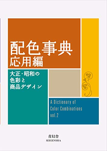

Torn between the two Wada dictionaries? Vol 1 vs Vol 2, compared plate by plate →
Book links are Amazon Associates affiliate links. Your price is unchanged; a small commission supports the archive. As an Amazon Associate we earn from qualifying purchases.
Last updated