Colors That Go With Pink
#F7A8B8 · a clear, soft pink
Pink (#F7A8B8) — a clear, soft pink — is a warm, saturated light and airy colour. It pairs best with complementary accent #4dcbb2, analogous (warmer) #eac9b5, and grounding neutrals, drawn from 767 historically-grounded combinations across 13 settings below.
Colour reference
- Hex
- #F7A8B8
- RGB
- 247, 168, 184
- CMYK
- 0, 32, 26, 3
- Temperature
- warm
- Lightness
- light and airy (81%)
- Contrast on white text
- 9.4:1 (AAA)
Pink by setting
Pink for walls
On walls, use terracotta & clay. 59 matching combinations.
Pink for a wedding
For a wedding, pair it with terracotta & clay. 59 matching combinations.
Pink for a bedroom
In a bedroom, layer it with terracotta & clay. 59 matching combinations.
Pink for a living room
In a living room, ground it with muted red. 59 matching combinations.
Pink for a kitchen
In a kitchen, contrast it with muted red. 59 matching combinations.
Pink for clothes
To wear with it, reach for terracotta & clay. 59 matching combinations.
Pink for an outfit
Build the outfit around terracotta & clay. 59 matching combinations.
Pink for cabinets
With cabinets, match it to terracotta & clay. 59 matching combinations.
Pink for a bathroom
In a bathroom, pair it with terracotta & clay. 59 matching combinations.
Pink for a nursery
In a nursery, soften it with terracotta & clay. 59 matching combinations.
Pink for a front door
On a front door, contrast it with terracotta & clay. 59 matching combinations.
Pink for an accent wall
On an accent wall, pair it with terracotta & clay. 59 matching combinations.
Pink for curtains
For curtains, choose terracotta & clay. 59 matching combinations.
Combinations with pink, from the 1933 Dictionary
Pink Dianthus & Water
The soft pink of wild dianthus beside the translucent blue of mountain water.
Corinthian Pink & Pale Lemon Yellow +1
Plate 169 from Sanzo Wada's 1933 Dictionary of Color Combinations — Corinthian Pink, Pale Lemon Yellow, Warm Gray.
Corinthian Pink & Brick Red +2
Plate 246 from Sanzo Wada's 1933 Dictionary of Color Combinations — Corinthian Pink, Brick Red, Sulpher Yellow, Cinnamon Buff.
Corinthian Pink & Venice Green +1
Plate 128 from Sanzo Wada's 1933 Dictionary of Color Combinations — Corinthian Pink, Venice Green, Light Mauve.
Corinthian Pink & Grayish Lavender - B +1
Plate 174 from Sanzo Wada's 1933 Dictionary of Color Combinations — Corinthian Pink, Grayish Lavender - B, Taupe Brown.
Corinthian Pink & Golden Yellow +1
Plate 206 from Sanzo Wada's 1933 Dictionary of Color Combinations — Corinthian Pink, Golden Yellow, Cinnamon Rufous.
FAQ
What colors go with pink?
Pink (#F7A8B8) — a clear, soft pink — is a warm, saturated light and airy colour. It pairs best with complementary accent #4dcbb2, analogous (warmer) #eac9b5, and grounding neutrals, drawn from 767 historically-grounded combinations across 13 settings below.
Is pink warm or cool?
Pink is a warm colour — 83% saturation, 81% lightness. Balance it with #eab5de or another cool/neutral partner.
What is the hex code for pink?
Pink is #F7A8B8 — RGB(247, 168, 184), CMYK(0, 32, 26, 3).
Other colors
Studio
Work with this colour
You have the hex code, the RGB/CMYK values and the computed partners for Pink. These are the materials a colour study like this actually gets made with.
-
Calibrite
ColorChecker Passport Photo 2
A pocket target for fixing white balance and exposure at the moment of capture — the step before any colour correction, if your palette starts from a photograph rather than a screen.
Listed on Amazon as Calibrite ColorChecker Passport Photo 2 Portable Color Calibration Kit for Photo and Video, 4 Target Set for White Balance, Exposure and Creative Look
View on Amazon -
Kuretake
Gansai Tambi 24 — Art Nouveau
Gansai are traditional Japanese watercolour pans — dense, matte and easy to mix, the closest everyday medium to the flat printed colour Wada's plates were made in. This is the Art Nouveau-themed 'II' edition, a different 24 to the standard set.
Listed on Amazon as Kuretake GANSAI TAMBI Watercolor Paint Set 24 Colors II - Art Nouveau
View on Amazon
Amazon Associates affiliate links — your price is unchanged and a small commission keeps the archive free. As an Amazon Associate we earn from qualifying purchases.
From the archive
Support the archive The full catalog, on your disk, as a thank-you.
- All 378 palettes (348 Wada + 30 editorial) in five formats
- Figma design tokens (W3C-spec JSON, drag into any file)
- Tailwind v4 + v3 configs — drop into any project
- CSS custom properties — every plate, one stylesheet
- 378 museum SVG plates — print-ready at any size
- Full JSON — colors, names, eras, moods, dominant hues
Launching soon. The free archive stays free, always.
Library
Go deeper on colour
The colour-theory books behind pairings like Pink — history, reference and the science of what works together.
Book links are Amazon Associates affiliate links. Your price is unchanged; a small commission supports the archive. As an Amazon Associate we earn from qualifying purchases.

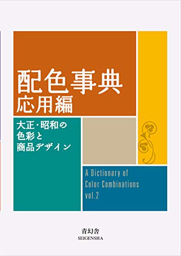


Torn between the two Wada dictionaries? Vol 1 vs Vol 2, compared plate by plate →
Book links are Amazon Associates affiliate links. Your price is unchanged; a small commission supports the archive. As an Amazon Associate we earn from qualifying purchases.