English has navy, denim, sky and teal. Japanese colour names divide blue by process: how many times the cloth went into the indigo vat, or which stone was ground to make the paint. That is why a list of traditional Japanese blues looks long and oddly specific. Most of it is one dye read at different depths.
The indigo ladder
Indigo does not stain cloth in one bath. The fabric goes in, comes out green, turns blue as it meets the air, and goes back in. Each dip darkens it. Dyers named the stops along the way, and the 10th-century court rulebook, the Engishiki, already grades hanada into deep, middle and pale versions by how much dye and how many dips they take. Read the four indigo names below as one scale, palest last.
藍 Ai — indigo itself
Ai is both the plant and the colour: the true indigo blue dyed from the leaves of Polygonum tinctorium. The leaves are composted into sukumo and fermented in a living vat, and by the Edo period Awa province (today's Tokushima) had built its economy on producing it. Ai became the everyday blue of the whole country: work jackets, shop curtains (noren), futon covers, festival coats. It reads ordinary Japan in the best sense: closer to denim than to ultramarine, with a slight green undertone that synthetic blues lack.
Working palettes: Turmeric & Indigo (the warm-yellow and indigo of folk textiles) and Wisteria & Indigo (a softer, court-leaning pair).
紺 Kon — the deepest indigo
Kon is indigo taken as far as it goes: dipped and dipped again until the cloth is nearly black. It was so central to the trade that an indigo dyer's shop was simply a kon-ya, and a proverb about the dyer who wears undyed white trousers, too busy dyeing everyone else's, is the Japanese version of the cobbler's children. Kon reads weighty and dependable, the navy of the tradition, but with more depth than a flat corporate navy.
Working palettes: Crimson & Navy (the formal court pairing, see the Four Reds) and Deep Indigo & Cream (workwear indigo on undyed cloth).
縹 Hanada — the middle blue
Hanada is the mid-point of the vat: paler than kon, deeper than asagi, a clear blue that sits between sky and blue-grey. It is one of the oldest names on the list and appears through court dress, summer kimono and shop curtains. In a palette it behaves as a quiet cool axis rather than an accent, which is why it turns up so often in Japandi work.
Working palette: Indigo Blue & Silver: hanada against silver grey and unbleached white.
浅葱 Asagi — the palest indigo
Asagi, literally "pale leek green," is a light blue-green: the first colour the cloth holds after a short dip. It has enough green to feel fresh and enough blue to feel bright. Its best-known use is the asagi haori, with white saw-tooth trim, worn by the Shinsengumi police in 1860s Kyoto. In design it works for summer, hospitality and wellness: a cool that does not feel cold.
Working palettes: Pale Blue & Vermillion (asagi lit by shrine red) and Valerian Yellow & Pale Blue.
The stone blues: ruri and gunjō
瑠璃 Ruri is the blue of lapis lazuli, named after the stone rather than a dye. It carries Buddhist weight: the healing Buddha Yakushi presides over an eastern paradise of lapis. Ruri is a jewel blue, saturated and slightly cool, for work that should feel precious rather than useful. Working palette: Lapis & Chalk, lapis against shell-white with a touch of gold.
群青 Gunjō is the painter's blue: ground azurite, one of the mineral pigments of Japanese painting. The grind sets the shade (coarse grains read deep, fine grains pale), so painters kept several gunjō at once. The most famous gunjō in Japanese art is probably Ogata Kōrin's Irises screens, azurite flowers and malachite leaves on gold leaf. Working palette: Ultramarine & Chalk White, which keeps the gold.
The palest: mizu-iro and sora
Below asagi the names stop being about dye and start describing things: 水色 Mizu-iro is "water colour," a pale clear blue, and 空 Sora is sky. Both are everyday words rather than craft terms. Working palettes: Pink Dianthus & Water and Sky Blue & Vermillion.
How to pick the right blue for a brief
- Textile or painting? Anything that should feel woven, worn or handmade wants indigo (ai, kon, hanada, asagi). A brief that should feel painted, gilded or precious wants a stone blue (ruri, gunjō).
- How deep? Pick the depth first, then the name: kon for authority, ai for everyday warmth, hanada for a calm background, asagi for freshness.
- Is there gold in the palette? Gold asks for ruri or gunjō; indigo against gold tends to look like a uniform.
- What is the warm partner? Indigo's classic partners are undyed cream, turmeric yellow and crimson. Asagi and sora take vermilion.
For more, the Japanese collection gathers the tradition's palettes, and the indigo and navy collections show the deep end at work. The companion pieces cover the four reds, the greens and the purples; every name is also in the glossary. Each colour page lists every palette that uses it, with contrast against white and black already calculated.
— colorcombinations.org editorial
Library
Go deeper on Japanese blues
The books behind this piece — colour theory, history and reference that designers keep close.

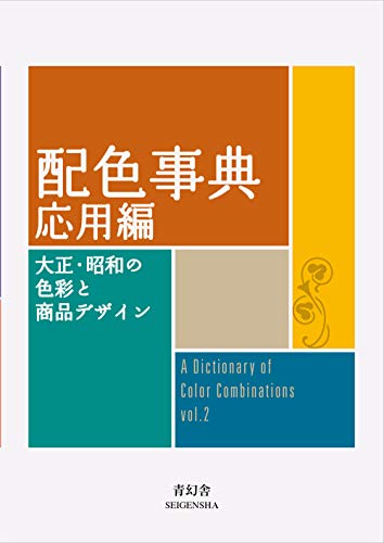


Torn between the two Wada dictionaries? Vol 1 vs Vol 2, compared plate by plate →
Book links are Amazon Associates affiliate links. Your price is unchanged; a small commission supports the archive. As an Amazon Associate we earn from qualifying purchases.
From the archive
Support the archive The full catalog, on your disk, as a thank-you.
- All 378 palettes (348 Wada + 30 editorial) in five formats
- Figma design tokens (W3C-spec JSON, drag into any file)
- Tailwind v4 + v3 configs — drop into any project
- CSS custom properties — every plate, one stylesheet
- 378 SVG plates (348 Wada + 30 editorial) — print-ready at any size
- Full JSON — colors, names, eras, moods, dominant hues
Launching soon. The free archive stays free, always.