Older Japanese did not always separate green from blue. The word ao covered both, which is why a green traffic light is still called ao today (the site's 青 Ao is exactly that in-between blue-green). The names that did split green off are concrete: each one points at a plant, a drink or a glaze. Group them that way and they are easy to choose between.
The evergreens: tokiwa and matsuba
常磐 Tokiwa means "eternal rock," and as a colour it is the deep green of trees that keep their needles through winter. The word carries permanence more than nature: it is the green of a temple cypress or a family crest. In folk textiles it is the standard partner for madder red, the Japanese "red and green" without the Christmas associations.
松葉 Matsuba, "pine needle," is the darker, greyer cousin. Pine stands for long life and appears in New Year decorations; the colour reads quiet, old and steady.
Working palettes: Madder Red & Evergreen and Crimson Lake & Pine.
New growth: moegi and wakatake
萌黄 Moegi is the yellow-green of a shoot just breaking the soil. In court and warrior culture it was a young person's colour; armour laced in moegi cord belongs to the young fighters of the war tales. It is the brightest traditional green and reads fresh, early, and a little bold.
若竹 Wakatake, "young bamboo," is softer and a touch bluer: the pale green of a new culm before it hardens. Where moegi is spring energy, wakatake is spring calm.
Working palettes: Spring Green & Ink (moegi at full strength against black) and Cherry Blossom & Young Bamboo, the spring pairing.
Tea and glaze: matcha and seiji
抹茶 Matcha is the colour of powdered green tea, the tea whisked in the tea ceremony: a muted yellow-green that reads natural and edible. It has become one of the most used Japanese colour names outside Japan, mostly through food and packaging.
青磁 Seiji is celadon, the grey-green of iron-bearing glaze fired on ceramics. Tea and incense objects made the colour stand for quiet refinement, and it is the green that stops reading as "nature" and starts reading as "object."
Working palettes: Matcha & Raw Silk and Celadon & Unbleached.
A note on painted green
Painters got their greens from stone: malachite, ground the same way as the azurite in the stone blues. That is the green of the leaves in Ogata Kōrin's Irises screens. The textile and tea names above are the ones that became everyday colour words, so they are the ones you will meet in a palette.
How to pick the right green for a brief
- Permanent or new? A brand that sells trust and time wants tokiwa or matsuba. One that sells a fresh start wants moegi or wakatake.
- Nature or object? Plant greens (moegi, wakatake, tokiwa) read outdoors. Seiji reads as a crafted thing; matcha sits between the two.
- What is the red? Madder and crimson want the deep evergreens. Cherry pink wants wakatake.
- How loud? Moegi against black is the only really loud pair here. Everything else works on cream or unbleached white.
For more, the Japanese collection gathers the tradition's palettes, and the green, sage and forest collections show these greens in modern use. The companion pieces cover the four reds, the blues and the purples; the glossary has the full list of names.
— colorcombinations.org editorial
Library
Go deeper on Japanese greens
The books behind this piece — colour theory, history and reference that designers keep close.

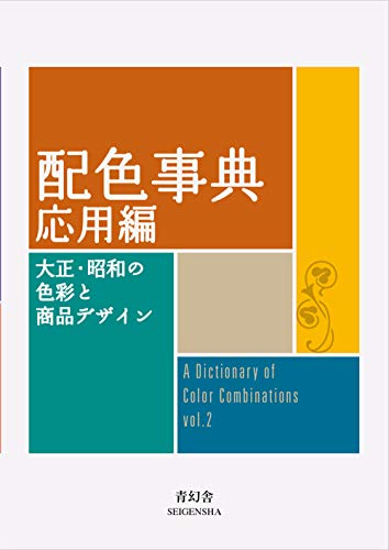


Torn between the two Wada dictionaries? Vol 1 vs Vol 2, compared plate by plate →
Book links are Amazon Associates affiliate links. Your price is unchanged; a small commission supports the archive. As an Amazon Associate we earn from qualifying purchases.
From the archive
Support the archive The full catalog, on your disk, as a thank-you.
- All 378 palettes (348 Wada + 30 editorial) in five formats
- Figma design tokens (W3C-spec JSON, drag into any file)
- Tailwind v4 + v3 configs — drop into any project
- CSS custom properties — every plate, one stylesheet
- 378 SVG plates (348 Wada + 30 editorial) — print-ready at any size
- Full JSON — colors, names, eras, moods, dominant hues
Launching soon. The free archive stays free, always.