A mood grouping only means something if it is consistent, so ours is computed, not curated: each plate's classification derives from its measured lightness, its hue membership, and its size. The definitions are below, the rule is in the method, and every count updates from the archive at build time.
How the 348 plates split by mood
- refined — 296 combinations (85%): mid-toned — neither notably dark nor pale; the dictionary's default register
- warm — 263 combinations (76%): contains a red or orange member
- austere — 120 combinations (34%): a two-color pairing — the smallest, most disciplined format
- bold — 108 combinations (31%): four colors — the largest, most assertive format
- cool — 65 combinations (19%): contains a blue or green member (and no red/orange)
- solemn — 33 combinations (9%): dark — average lightness below 35%
- serene — 19 combinations (5%): pale — average lightness above 70%
Two structural facts stand out. First, the dictionary leans firmly warm: far more plates contain a red or orange member than a cool blue or green one. Second, the extremes are rare — genuinely dark (solemn) and genuinely pale (serene) sets together make up a small fraction of the archive. Wada worked overwhelmingly in the mid-tones, which is a large part of why the plates feel so wearable: they were composed for kimono fabric and printed goods, not for posters.
Warm — three plates to start with
Cool — three plates to start with
Solemn — three plates to start with
Serene — three plates to start with
A seasonal reading of the dictionary
Japan's color tradition has read palettes seasonally since the Heian court's kasane no irome calendar, so a seasonal cut of Wada's plates is a natural question. The dictionary itself assigns no seasons; the grouping below is our computed reading, from hue family and lightness (rule in the method):
- Spring — 10 combinations (3%): pink and fresh-green plates that are not dark — the budding register
- Autumn — 284 combinations (82%): mid-toned red, orange, and yellow plates — the largest seasonal family, matching the dictionary's warm bias
- Summer — 22 combinations (6%): blue and green plates plus the pale non-warm sets — cool and airy
- Winter — 32 combinations (9%): the dark warm plates and the neutral sets — reduced and severe
Spring — three plates
Autumn — three plates
Summer — three plates
Winter — three plates
Choosing by mood instead of by browsing
The practical use of these groupings: decide the atmosphere first, then pick inside the matching group. A brand that needs gravity starts in the solemn plates; packaging for spring produce starts in the spring set; an interface that must stay calm starts cool and mid-toned. Because each group is small, choosing becomes a short comparison instead of a 348-plate scroll — and every plate links to its own page with contrast data and export formats.
Method
Moods are assigned deterministically per plate: average HSL lightness below 35% → solemn, above 70% → serene, otherwise refined; a red or orange member → warm, else a blue or green member → cool; two colors → austere, four → bold. Seasons read the dominant hue plus lightness: non-dark pink/green → spring; blue/green or pale non-warm → summer; mid-toned red/orange/yellow → autumn; dark-warm and neutral sets → winter. The 30 modern editorial palettes are excluded; all figures describe the 348 historical plates. Source data is public domain; this analysis is CC BY 4.0.
— colorcombinations.org editorial
Library
Go deeper on palettes by mood
The books behind this piece — colour theory, history and reference that designers keep close.



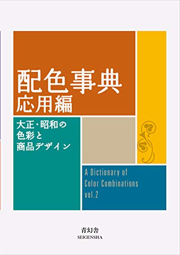
Torn between the two Wada dictionaries? Vol 1 vs Vol 2, compared plate by plate →
Book links are Amazon Associates affiliate links. Your price is unchanged; a small commission supports the archive. As an Amazon Associate we earn from qualifying purchases.
From the archive
Support the archive The full catalog, on your disk, as a thank-you.
- All 378 palettes (348 Wada + 30 editorial) in five formats
- Figma design tokens (W3C-spec JSON, drag into any file)
- Tailwind v4 + v3 configs — drop into any project
- CSS custom properties — every plate, one stylesheet
- 378 museum SVG plates — print-ready at any size
- Full JSON — colors, names, eras, moods, dominant hues
Launching soon. The free archive stays free, always.