About this combination
Combination 137 of 348 in Wada's six-volume 1933 work. A 3-colour grouping of Etruscan Red, Cinnamon Buff, Pistachio Green, as documented in the original plates.
Historical context
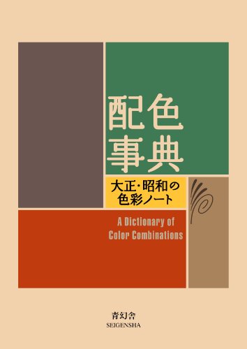
Plate 137 of Wada's 348 anchors Etruscan Red, Cinnamon Buff and Pistachio Green in the red family — a 3-colour grouping with a refined, warm character, recorded in Sanzo Wada's 1933 Dictionary of Color Combinations (six volumes; Seigensha Art Publishing 2010 reprint), and in the public domain by age. Its strongest pairing — Etruscan Red on Cinnamon Buff — reaches a contrast ratio of 2.86:1, below the WCAG text-contrast floor, so it reads best in decorative blocks rather than text pairings.
The numbers behind Etruscan Red & Cinnamon Buff +1
Computed from the 3 hex values on this page. Use them to decide where each colour goes before you open a design file.
- Etruscan Red
#C55347· RGB 197, 83, 71 · HSL 6°, 52%, 53% · LRV 19. Text on it: white, 4.46:1 (large text only). - Cinnamon Buff
#FDC57E· RGB 253, 197, 126 · HSL 34°, 97%, 74% · LRV 62. Text on it: near-black, 11.2:1 (AAA). - Pistachio Green
#648F7B· RGB 100, 143, 123 · HSL 152°, 18%, 48% · LRV 24. Text on it: near-black, 4.8:1 (AA).
Hue
On the HSL colour wheel: Etruscan Red at 6°, Cinnamon Buff at 34°, Pistachio Green at 152°. The widest gap is 146°, between Etruscan Red and Pistachio Green, so the combination works by contrast of hue rather than by family.
Light and dark
Lightness runs from 48% (Pistachio Green) to 74% (Cinnamon Buff), a 26-point spread: a moderate value spread: the colours separate in greyscale, but not strongly, so keep text off the closer pairs. Temperature: Etruscan Red, Cinnamon Buff are warm (reds, oranges, yellows); Pistachio Green is cool (greens, blues, violets). A warm-cool mix lets one side advance and the other recede.
A starting split
The 60-30-10 convention gives the largest area to the quietest colour and the smallest to the loudest. Ranked by saturation that means Pistachio Green (18%) for about 60%, Etruscan Red (52%) for about 30%, and Cinnamon Buff (97%) as the 10% accent. It is a starting point, not a rule: Wada's plates show the colours at equal size.
Where these colours appear again
- Etruscan Red appears in 6 other combinations, including Etruscan Red & Nile Blue and Etruscan Red & Grayish Lavender - B.
- Cinnamon Buff appears in 8 other combinations, including Cinnamon Buff & Light Mauve and Cinnamon Buff & Pistachio Green +1.
- Pistachio Green appears in 1 other combination, including Cinnamon Buff & Pistachio Green +1.
Etruscan Red is a name from Robert Ridgway's 1912 Color Standards and Color Nomenclature, plate XXVII. Cinnamon Buff (spelled "Cinnamon-Buff") a name from Robert Ridgway's 1912 Color Standards and Color Nomenclature, plate XXIX. Pistachio Green is a name from Robert Ridgway's 1912 Color Standards and Color Nomenclature, plate XLI. Why Wada's English names come from Ridgway.
Accessibility
WCAG contrast ratios between every color pair. Use the strongest combinations for text; the weakest ones make good decorative backgrounds.
Strongest pair: Etruscan Red on Cinnamon Buff — 2.86:1 (Fail)
- Etruscan Red·Cinnamon Buff
- Etruscan Red·Pistachio Green
- Cinnamon Buff·Pistachio Green
Of the 3 pairs here: 3 are decorative only, below 3:1.
Studio
Taking Etruscan Red & Cinnamon Buff +1 off the screen
A hex code is an instruction to a screen, not a colour. Where this palette is going decides what it needs next.
Affiliate links — as an Amazon Associate we earn from qualifying purchases.
-
...onto paper
Start here if the palette gets printed. Screen colour and ink colour are not the same colour, and this is the deck that translates between them.
Pantone
Formula Guide — coated & uncoated
Listed on Amazon as Pantone Formula Guide – Coated & Uncoated New Version | Professional PMS Color Matching System
See price on AmazonView on Amazon -
...onto a screen you can trust
Start here if it stays digital. An uncalibrated monitor is the single most common reason a palette that looked right on your desk looks wrong everywhere else.
Calibrite
ColorChecker Passport Photo 2
Listed on Amazon as Calibrite ColorChecker Passport Photo 2 Portable Color Calibration Kit for Photo and Video, 4 Target Set for White Balance, Exposure and Creative Look
See price on AmazonView on Amazon -
...by hand
Start here if you are mixing it. Wada's plates were flat printed colour; gansai pans are the closest everyday medium to them.
Strathmore
300 Series watercolour pad, 140 lb cold press
Listed on Amazon as Strathmore 300 Series Tape Bound Watercolor Pad, 140 lb. Cold Press, 11 X 15 inches, White, 12 Sheets (360-111)
See price on AmazonView on Amazon
Amazon Associates affiliate links — your price is unchanged and a small commission keeps the archive free. As an Amazon Associate we earn from qualifying purchases.